
I had a short city break in Birmingham the other day when I had intended to visit some of the main art galleries. Unfortunately, the main Birmingham Museum and Art Gallery in the centre of the city was closed until late April, for essential electrical works and so I was able to concentrate my cultural journey on a visit to the Barber Institute of Fine Arts at the centre of the Birmingham University Campus. I had been here once before, five years ago and especially fell in love with two of the paintings. The Barber Institute is a smaller gallery in comparison to the main one in the Birmingham centre and yet it is full of artistic treasures by the most famous artists. In my next three blogs I will introduce you to and tell you about some of the wonderful paintings in their permanent collection, so as to tempt you to visit the museum.
The Barber Institute of Fine Arts is housed in one of Birmingham’s finest Art Deco buildings and was opened in 1939. The architect tasked with designing the building was Robert Atkinson, one of Britain’s leading architects of the 1920s and ’30s. The building is laid out around the central music auditorium, surrounded by corridors. On the Ground floor these form offices and lecture halls for the Departments of Music and History of Art, as well as a dedicated Art History library. The galleries occupy the same space on the first floor, approached by a stunning travertine staircase directly opposite the entrance.

The first painting I want to present to you is one of my all-time favourite landscape works. The 1832 work, entitled Ramsau, is by Thomas Fearnley. Fearnley was born in Norway, but studied abroad, often with his fellow countryman Johan Christian Dahl. It was whilst working alongside Dahl that Fearnley developed the habit of painting directly en plein air. Fearnley was travelling to Italy when he and his party stopped at the village of Ramsau, a small town located on the Königssee in the district of Berchtesgadener Land in Bavaria. In the painting we can see the road winding and disappearing around a corner of the village before we catch a glimpse of it again as it heads off towards their destination, the snow-covered Alps and the beautiful snow-capped Hoher Göll, which straddles the border between the German state of Bavaria and the Austrian city of Salzburg. It is such a beautifully tranquil scene. In the middle ground of the depiction, we see a lone farmer collecting hay. Such hard work was so important so as to have food for his animals during the harsh and bitterly cold winter, which was fast approaching. This en plein air work would have taken Fearnley several sittings during the week-long stay, on each occasion adding another layer of colour.

I have always loved the works of the Dutch Golden Age painter, Jan Steen, so I was pleased to see one of his works in the Barber Institute’s collection. It was not one of his exuberant genre scenes but a Biblical painting. It was his painting The Wrath of Ahasuerus which he completed around 1670. The characters who appear in the painting come from the Old Testament Book of Esther. The depiction before us is an episode in the life of the Persian king Ahasuerus and his Jewish wife Esther. King Ahasuerus had sought a new wife after his queen, Vashti, had refused to obey him, and Esther, the adopted daughter of the Jew Mordecai, was chosen for her beauty. The subject of the painting is from Esther vii, 1-7. Haman, the king’s First Minister had issued a decree that all the Jews in Persia should be killed. Esther, the wife of the king, held a banquet and at it she confessed that she was a Jew, and that she too was threatened by Haman. So we see in the painting, on hearing what his wife had to say about Haman, her husband jumps up in a violent reaction to what he has just heard. Ahaseurus explosive and exaggerated gesture, eyes bulging, red in the face, fists clenched, jumps up knocking over a vase and the peacock pie. Haman, on the left, cowers away from the king’s fury. The peacock is a symbol of pride and is a reference to Haman’s fallen pride and his downfall. The king ordered Haman to be hung. This story of Esther’s triumph over the evil Haman was popular with the Dutch people who could see the similarity between her battle and their plight against the mighty, and in their eyes, the evil Spanish invaders and occupiers of their country, being a similar story.
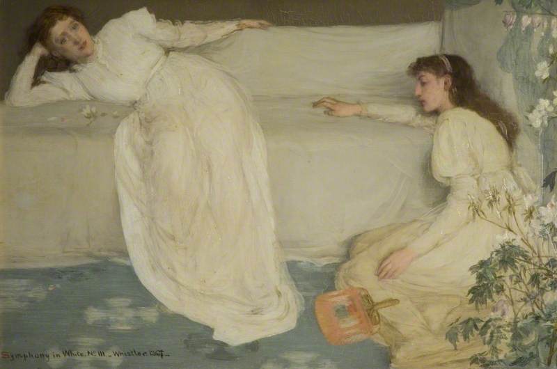
James McNeill Whistler completed Symphony in White No. 3 in 1867 and it is now part of the Barber Institute collection. It was thought to have been originally entitled Two Little White Girls. Two women are depicted in the painting. One, sitting on a sofa, is Joanna Heffernan, Whistler’s mistress. The other, resting on the floor in the cream/yellow dress, is Millie Jones, the wife of an actor friend. Laying on the floor is an Oriental fan which is a reminder of the popular Japonisme cult of the time. Japonisme was a French term that referred to the popularity and influence of Japanese art and design among a number of Western European artists in the nineteenth century. Whistler had embarked on this painting in July 1865 and within a month, he had completed the preliminary sketches and by September he had completed the work and had signed and dated it.
However, he was not happy with what he saw and began to rework it and Whistler was not finally satisfied with it until 1867 when it was exhibited at the Royal Academy. He painted over the final “5” in the original date, and replaced it with a “7”, to mark the changes it had undergone.
Whistler chose the term ‘Symphony’ to highlight to visitors to the exhibition that it was purely a study in colour and the connection of two branches of the Arts, music and art.. It was the first of Whistler’s paintings to be exhibited with a musical title. And so, why was it entitled “No. 3”?
The reason behind this numerical conundrum was that Whistler’s 1863 painting was given the title White Girl but Paul Mantz, a French art historian and writer for the Gazette des Beaux-Arts, called it ‘Symphonie du blanc‘, and so it was later renamed Symphony in White. No. 1.

In 1864 Whistler completed a second similar work entitled The Little White Girl, which later became known as Symphony in White. No. 2. In their 1908 biography of Whistler, The Life of James McNeill Whistler, Elizabeth and Joseph Pennell, make the point that this may have been a factor that influenced Whistler in his choice of titles for the third in the series.

The work was greatly admired by all who saw it. It is thought that Deagas drew inspiration from Whistler’s painting when he worked on his painting, Portrait de Mlle Eugénie Fiocre in the Ballet “La Source”
However, there were some critics who were not altogether in love with the work. Philip Hamerton, an English artist, art critic and author, writing for the Saturday Review on 1 June 1867, remarked:
“…In the “Symphony in White No. III.” by Mr. Whistler there are many dainty varieties of tint, but it is not precisely a symphony in white. One lady has a yellowish dress and brown hair and a bit of blue ribbon, the other has a red fan, and there are flowers and green leaves. There is a girl in white on a white sofa, but even this girl has reddish hair; and of course, there is the flesh colour of the complexions…”
Whistler was horrified by what had been written in the journal and wrote a letter to the editor but he would not print it. However in Whistler’s own book, The Gentle Art of Making Enemies, he reproduced the letter in which he had written:
“…How pleasing that such profound prattle should inevitably find its place in print!…Bon Dieu! did this wise person expect white hair and chalked faces ? And does he then, in his astounding consequence, believe that a symphony in F contains no other note, but shall be a continued repetition of F, F, F ? . . . Fool!…”
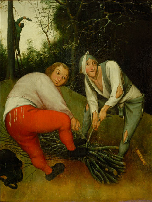
For my last offering in Part One of my blog relating to my best-loved works in the collection of the Barber Institute I have reverted to one of my favourite painters, Pieter Brueghel the Younger. He was the son of one of the greatest sixteenth century artists, Pieter Bruegel the Elder, and the brother of Jan Breughel. This amusing and fascinating painting entitled Two Peasants binding Faggots, was completed around 1615, and it was the type of work which was popular in the seventeenth century. It was entitled Two Peasants binding Faggots. It is a depiction of peasants binding a bundle of stolen branches for firewood whilst their fellow accomplice is seen in the background cutting the branches of a tree. The two peasants in the foreground glance around furtively and from that we gather that they are up to no good, The larger of the two, on the left, is stout symbolising the sin of gluttony whilst his thinner and gaunt accomplice with a paler face and wearing a codpiece has a bandage around his head and it is thought that Brueghel has depicted this as it relates to the Flemish proverb “to have toothache behind the ears” meaning a malingerer. On the ground, next to the gaunt-looking man, is a pipe which is a traditional phallic symbol and represents the sin of lechery.

The artist’s father, Pieter Bruegel the Elder, had painted a large work, Netherlandish Proverbs, in 1559, which featured a large number of similar characters each representing various Netherlandish proverbs which today is part of the Staatliche Museen collection in Berlin.
…………….to be continued.

