Vasily Perov, Part 1 – the critical realist

Portrait of Vasily Perov by Igor Kramskov (1881)

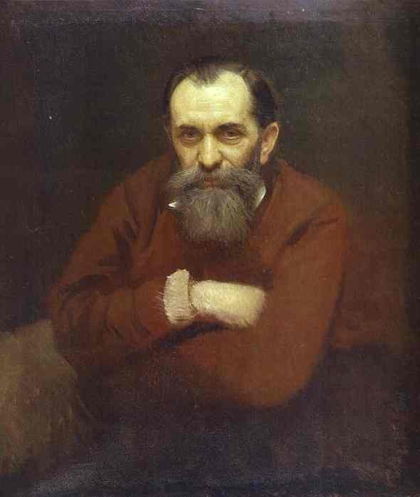
For my blog today, I am returning to Russia and featuring one of its greatest nineteenth century artists, Vasily Grigoryevich Perov.  He is known as one of the great critical realism artists of his time.

Perov was born in 1834 in the town of Tobolisk, a Siberian town, which lies east of the Urals.  Perov was the illegitimate child of Baron G K Kridiner, the provincial prosecutor for the region of Arzamas.  Perov, who was born prior to his mother and father’s marriage, was given the surname of his godfather, Vasilyev and yet, Perov himself disliked the name and had it changed to Perov, which was his nickname as a child as he was an excellent hand writer and a talented calligrapher.  Pero in Russian means pen.

Sermon in a Village by Vasily Perov (1861)

In 1846, Vasily Perov received his first painting lessons, at the age of twelve, at the Alexander Stupin Art School in Arzamas. Stupin was a painter of the classicism genre, whose school was the first of its type in provincial Russia.  From there, in 1851, Perov moved to Moscow and entered the Moscow School of Painting, Sculpture and Architecture, which was one of the largest educational institutions in Russia.  It was here that he studied under Sergey Zaryanko, a Russian painter of Belarusian birth.   Whilst at the academy, he won a number of awards for his work from the St Petersburg Imperial Academy of Arts and his major award was when he won the Grand Gold medal for his diploma work in 1861.  The work was a set of preliminary sketches and the finished painting, Sermon in a Village.  He was also awarded a scholarship to travel abroad to enhance his knowledge of European art.

The Sermon in a Village is not simply a depiction of the congregation listening to a sermon.  In the centre foreground we see a nobleman asleep, head slumped forward on his chest.  He has no interest in the sermon.  He is just present to be seen.  Sitting next to him is his dutiful wife, prayer book in hand,  who plays coy as an admirer standing behind her flirts with her.  Look at the woman who stands behind the sleeping nobeleman.  She pulls her veil away from her ear and leans forward to try and hear the sermon.  Next to her one of the nobleman’s footmen tries to prevent her getting to close to his master. Earlier paintings depicting Russian clergy depicted them with veneration and the utmost respect so this mocking depiction of the church clergy by a young up and coming artist was frowned upon by the Establishment but it was accepted as an exhibit and won the artist, Perov, a European trip.

The Village Religious Procession at Easter by Vasily Perov (1861)

The preliminary sketches and painting, which won him the Gold Medal, were not his initial submission.  His original submissions were preliminary sketches for another of his works, The Village Religious Procession at Easter.  However the Academy rejected these because of their overt criticism of the Church and the clergy.  One needs to understand that Perov wanted to not only highlight the plight of the poor and the deprived, he wanted to condemn the role of the Church and its leaders who led a comfortable life and, in his mind, offered little comfort to the poor.  Despite the St Petersburg Academy’s rejection of his preliminary sketches for the The Village Religious Procession at Easter, he completed the work in 1861.

This oil on canvas work was his way of recording his belief that the clergy had forgotten their duty to parishioners.  It was blatantly an anti-clerical depiction.  The setting is a dull landscape.  The discordant movement of the participants in the procession together with the gloomy sunset accentuates the unattractiveness of the whole scene.  Before us, we see a drunken mix of clergy and their congregation embarking on a parade of icons through the village. Some of the people in the parade are carrying icons and gonfalons (a type of heraldic flag or banner, often pointed, swallow-tailed, or with several streamers, and suspended from a crossbar).  In the foreground of the painting, the peasants stagger past us towards a precipice with half-closed eyes.  It is as if they are all blind. We can make out a woman with an icon that has lost its face. A little further on, we observe the figure of a poor man carrying an icon upside down, albeit, we can still make out the “all-seeing” eye on the gonfalon and maybe Perov left it in to remind people that nobody can escape the Supreme Judgment.  The leader of this group is a drunken priest who we can see on the right, standing on the steps of the wooden building, hanging onto the upright structure to stop him falling.  We can also see, despite the desperate efforts of one of his helpers, that he has stepped on and crushed the Easter egg.  He has abandoned his “flock”.

Religious Procession in Kursk Province by Ilya Repin (1883)

The painting was exhibited at the Society for the Encouragement of Artists in St Petersburg but the curators were told to remove it on grounds that it was an “immoral” work, which criticised the Church and its clergy.  Even the press were banned from reproducing it in their newspapers; such was the power of the Church at the time.  Twenty years later Ilya Repin completed his famous work, Religious Procession in the Province of Kursk (See My Daily Art Display Aug 29th 2011), which again compared the lot of the downtrodden peasant class and the wealth of the clergy.

In 1862, Perov chose to go to France and also visited some German cities.  He returned home in 1864, even though his scholarship would have funded a longer stay in Europe.  Maybe he missed his homeland.

Perov lived through the 1860’s in Russia and was well aware of the social problems in his beloved country and he began to highlight the plight of the poor and downtrodden as well as contrast that to the wealth of the Russian church and its hierarchy.  Perov’s paintings carried strong social implication and thus his realistic depictions became an important landmark in the history of Russian painting.

Marriage à la Mode by William Hogarth (c.1743)

Perov, at this time, had become influenced by the work of Pavel Fedotov,  who is now looked upon as the founder of critical realism in Russian art.  Perov was also aware of the genre scenes by the Old Dutch masters, often depicting poverty.  Another painter who influenced him was the English painter William Hogarth, the eighteenth century pictorial satirist and social critic whose work ranged from realistic portraiture to what is referred to as Sequential Art, which uses images arranged in sequence for graphic storytelling or to communicate information, a kind of narrative art. One example of this is Hogarth’s almost comic strip series which questioned the morals of the privileged (see – Marriage a la Mode – My Daily Art Display May 4th – 9th 2011).

On his return to Moscow he became one of the founder members of a group, known as the Peredvizhniki, often referred to as The Wanderers or The Itinerants.  This group of artists were influenced by the liberal ideas of the philosopher and critic, Nikolay Chernyshevsky and the philosopher, Vissarion Belinski.  They established the first Free Society of Artists in Russia. In a way it was a group, which felt it their duty to portray, through their art, the necessity of denouncing the social order in Tsarist Russia.  Other great Russian artists which were part of this group and have featured in My Daily Art Display were, Ilya Repin, Alexei Savrasov, Isaac Levitan and the landscape painter, Ivan Shishkin.  This group of young artists, who in protest at Academic restrictions formed themselves into a co-operative.  Perov’s influence on the art of the time, developing realism in art during the last five decades of the nineteenth century, cannot be underestimated.

The Drowned Woman by Vasily Perov (1867)

The height of Perov’s success as a realist and genre painter came around the latter part of the 1860’s.  In 1867 Perov produced the highly emotive work entitled The Drowned Woman.    In Perov’s painting we see a policeman, who has just dragged the body from the river.  He is sitting, smoking his pipe, and looking down on the dead woman.  The artist wants us, like the policeman, to think what might have been the circumstances of the young woman’s death.  Had life been just too hard to bear?   The casualness of the policeman’s demeanour gives us the idea that the dragging of a lifeless body from the river was a common occurrence.  It should be remembered that what we see in Perov’s depictions of social inequality was mirrored in the literature of the time by the likes of Fyodor Dostoyevsky whose writing explored human psychology at a time of the difficult political and social mood of 19th-century Russia.

Found Drowned by George Frederic Watts (c.1850)

The subject of this work by Perov harks back to a work by the English realist painter, George Frederic Watts, and his 1855 work Found Drowned, a portrayal of a fallen woman, who drowned and whose body was discovered on the shores of the Thames.  (See My Daily Art Display July 4th 2011).

The Last Journey by Vasily Perov (1865)

In 1865 Perov produced another heart wrenching oil on canvas work entitled The Last Journey, which can now be seen in the Tretyakov Gallery in Moscow.  It is a depiction of both sorrow and condemnation.  There is an overwhelming sense of bereavement as we see a horse-drawn sleigh driven by an old woman.  We just see the back of her, hunched over, driving the horse.  She is taking the wooden coffin, which contains her recently deceased husband and breadwinner, to his final resting place.  Also on the sleigh are two children who, like the woman, face an uncertain future.  Their pet dog follows on.  The painting is gloomy matching the atmosphere of the story behind the depiction. Dark clouds are seen above the funeral cortege.  It is thought that Perov got the idea for this painting when he read the book, The Red Nose Frost, published in 1863 by Nikolai Nekrasov.  It is in two parts, the first part tells about a funeral of a young peasant and in the second part of the widow fight for survival in the forest. Nekrasov was a Russian poet, writer, critic and publisher.  His intensely empathetic poems about peasant life made him the hero of the freethinking and revolutionary circles of Russian intelligentsia.

Troika by Vasily Perov (1866)

I am completing this first part of my blog about Vasily Perov by featuring one of his greatest and certainly his largest genre painting (123 x 168 cms).  It has the simple title, Troika, which is the Russian word for “group of three”, and was completed in 1866 and now resides in the Tretyakov Gallery in Moscow.  It is a pictorial social commentary, which in this case, focuses on child labour.  We see children pulling a sled piled high with heavy barrels.  They face us.  Look at the way Perov has depicted their faces.  There is of course a child-like quality about them but one cannot fail to notice the pain and suffering their task is causing.  The air of gloom is added to by Perov’s background – The backdrop, the gloomy walls of the monastery create a mood of hopeless melancholy.  The children are being used and humiliated by this onerous task.

In my next blog I will showcase more of Perov’s paintings and look at the final years of his life.

Albert Joseph Moore. Part 3 – the conclusion.

Albert Joseph Moore (c.1870)

The Aesthetic art movement thrived in Britain and America during the 1860s to the 1880s.   The movement started in a small way in the studios and houses of a radical group of artists and designers, including William Morris and Dante Gabriel Rossetti.  In works of art the leading British exponents of this aesthetic movement were J.M.Whistler, Frederic, Lord Leighton and Albert Joseph Moore.  This style of art was also known as Art for Art’s Sake.  The Oxford  Dictionary defines Aestheticism as:

“… the term applied to exaggerated expression of the doctrine that art is self-sufficient   and needs serve  no ulterior purpose, whether moral, political or religious…”

It was influenced by Japanese art and culture.  It was not universally loved and the art critic Walter Hamilton wrote a book in 1862, The Aesthetic Movement in England, in which he mounted a famous defence of the Aesthetic Movement and wrote about the key figures associated with the movement and provided descriptions of contemporary responses to it.

Albert Moore was one of the principal originators of the Aesthetic Art Movement, and was considered by Whistler as one of the most original artists of his generation.  His  decorative paintings, which were true to the Aesthetic movement, championed pure beauty in their depiction but  lacked messages whether overt or subtle, and this type of art became very popular with collectors.  His depiction of women, in what is termed a Hellenic style, draped in their diaphanous clothing, was one which will always be linked with Moore.  Following the success he had with his work entitled The Marble Seat, he followed it up with a series of purely decorative paintings.  In all of these, the allure of the works was Moore’s depiction of the female form and the harmonious use of colour.

A Musician by Albert Moore (1865-6)

One of Albert Moore’s patrons, around this time, was James Leathart, a Newcastle lead manufacturer.  He had visited Moore at his studio in 1865 and whilst there saw an unfinished work by the artist entitled A Musician.  The work combines aspects of ancient Roman wall paintings, Greek sculpture and Japanese prints.  The figures in the painting are separated.  On the left side we have an active male musician playing the lyre and on the right we see his audience of two passive females.  This separation by gender was also present in his painting, The Marble Seat (see previous blog).

Leathart bought this work from Moore and It can now be seen at the Yale Centre for British Art, New Haven.  In 1867 he purchased from Moore his work Elijah’s Sacrifice.

Battledore by Albert Moore (1870)

Leathart was so pleased with his acquisitions that he commissioned Moore to produce a pair of classically draped figures, each bearing a shuttlecock and racket.  The two commissioned paintings were to feature two ancient games played by both men and women.  It was the precursor to jeu de volant, which was itself the precursor to badminton.  The simple titles to his paintings were Battledore and Shuttlecock.

In a letter to Leathart in November 1868, Moore wrote:

“…now fairly at work on your two pictures and propose to go on with them continuously until they are finished…”

Leathart went to Moore’s studios to see what progress Moore had made and viewed the preparatory sketch.  However Moore had a change of heart with regards the colours and tones he would use and in February 1869 he again wrote to Leathart to tell him that he had:

“…hit upon combinations of colour darker in character than the little sketch you saw some time ago…”

Now, Moore had a dilemma.  He wanted to press ahead with the final paintings but had to be sure that Leathart agreed to his proposed changes to the colours and in his letter to Leathart, he gave his reasons for the change but to avoid problems with his patron hinted that Leathart had the final say.  Moore wrote:

“… I think it is best to learn your views on the subject.  That is to say, if you have any particular desire that the pictures should be kept light in character – as for instance, for the sake of their effect in your room – I shall of course be ready to recur to something like the original scheme: at the same time I have reason to believe that the latter combination would succeed – having tried them in small sketches and I may say I should not hesitate to carry them out, were I the only person concerned…”

Leathart agreed to the changes.

Principles of Harmony and Contrast of Colours by M.E.Chevreul
Principles of Harmony and Contrast of Colours
by M.E.Chevreul

Moore was fascinated by colour combinations and how some worked better than others.   Whilst studying at the School of Design in York he had studied this very issue and was inspired by Michel Eugène Chevreul who had published a book in 1855 entitled The Principles of Harmony and Contrast of Colour.  Chevreul based his ideas on the study of the coloured threads in the Gobelin tapestries.

Shuttlecock by Albert Joseph Moore (1870)

In his work, Shuttlecock , Moore brought together the colours of orange and blue which Chevreul had written were “harmonies of contrasts”.  Although chromatically opposites, orange and blue combined to produce grey.  Look at the colour combinations on the mat which the female stands upon.   When the two paintings were exhibited at the Royal Academy in 1871 Moore was praised for his depiction of the figures but those who detected Moore’s scientific approach to colour combinations were less happy.  Other critics were unhappy with the fact that there was no message within the painting, no historical or biblical connotation to the depiction

Sea-gulls by Albert Moore (1871)

Along with Battledore and Shuttlecock Moore had a third painting accepted for the 1871 Royal Academy Exhibition.  The title of this third work was Sea-gulls.  This painting eventually came to fruition but not without some controversy.  Moore’s friend James Whistler got to hear of, and later saw the preliminary sketches for this painting through their mutual friend and patron Frederic Leyland and Whistler was concerned that they were very similar to preliminary sketches he had made for his own painting.  After lots of discussions between the two artists and an intermediary, William Nesfield, an architect and amateur painter, and a  friend of both Whistler and Moore, it was amicably decided that Moore exhibiting his Sea-gulls painting would not have an adverse effect on Whistler’s works.  The painting was exhibited at the RA even though, according to Moore,  it was unfinished.  On receiving the work back from the exhibition, Moore completed the work and it was sold to his patron, Frederic Leyland.

A Summer Night by Albert Moore (1864-90)

There are so many beautiful paintings done by Albert Moore that it is difficult to select a only a few for the blog.  However, the next painting by Albert Moore which I am featuring took almost six years to complete and it is a veritable beauty.  Moore started this large work (132 x 229 cms) in 1884 but did not complete it until 1890.  It was entitled A Summer Night.

The backdrop for this work was not Moore’s usual wall but a fascinating and beautiful display of floral garlands, all intertwined together.  In the far background, across the sea, we see the twinkling of shore lights of an island which has been lit up by moonlight.  Pale clouds can be seen in the dark sky.  In the upper left foreground, we can see orange-coloured ranunculus blooms weaved into the upper part of the silver filigree which is part of the open trellis-work.  The painting received a rapturous reception from the public when it was exhibited at the 1890 Royal Academy exhibition, despite the RA’s Hanging team banishing the work, high up on a wall in the fifth room, close by a door.

The fact that Moore’s work was often looked down upon by the art institution for his constant scientific manipulation of colours and for producing paintings without any hidden meanings was not lost on the forward-thinking art critic of the time, Claude Phillips, who had, for a long time been a great supporter of Moore.   In an article in the Academy in May 1890, he wrote:

“…no artist of purely British origins has the same mastery over the keyboard of tints and tones as this master of decoration and that such a painter should persistently be excluded from the ranks of the Academicians while that august body contains so many crude, perfunctory and unspeakably tiresome practitioners, is a riddle the solution of which had, perhaps, better not be attempted…”

The art critic George Moore (no relation to Albert Moore) castigated the Royal Academy for not electing to the Academy, either Albert Moore or his friend James Whistler.  In 1893, he caustically wrote:

“… Many Academicians will freely acknowledge that his [Albert Moore] non-election is a very grave scandal;  they will tell you that they have done everything to get him elected and have given up the task in despair……………..the two greatest artists living in England, will never be elected Academicians; and artistic England is asked to acquiesce in this grave scandal…”

The Loves of the Winds and the Seasons by Albert Moore (1893)

The last painting I am showing you was the last painting Albert Moore completed.  It was entitled The Loves of the Winds and the Seasons, which he completed in 1893.  Moore’s financial situation at the start of the 1890’s was dire and to make things worse is health was starting to decline.    In August 1892 Moore had been taken seriously ill and despite a number of operations he was made to suffer from a painful and incurable illness.  Moore would not let his pain or his advancing death stop him from painting and this last painting which he started in 1890, was completed nine days before his death.  The painting depicts the courtship of the four male winds with the four female seasons.  The female figure on the left is Summer and she watches the courtship of the South Wind and Autumn.  In the right background of the painting we see the North and East Winds quarrelling over Winter whilst they are all stood in a patch of snow.

Albert Joseph Moore died at 3am in his London studio in Spenser Street, Westminster on September 25th 1893, three weeks after his fifty-second birthday.   The cause of death was given as a sarcoma of the thigh and a recurrent sarcoma of the abdomen.  He made his brother Henry sole heir to his estate which amounted to just £1,184.  He was buried in the family grave in Highgate Cemetery, which was already occupied by his mother and his brother, John Collingwood Moore.

———————————————————————————

Most of the information I have used in this and the next blog have come from  two books, biographies of Albert Joseoph Moore. They are:

Albert Moore, his life and works, by Alfred Lys Baldry (1894)

Albert Moore by Robin Asleson (published by Phaidon)