Portrait of Theodoor Rombouts by Anthony van Dyck
In my last two blogs regarding the Groeninge museum in Bruges, I looked at the works of the Flemish Primitive painters. In this edition of the blog I want to showcase the life and works of an early seventeenth century Flemish painter known for his Caravaggesque genre scenes depicting lively dramatic gatherings. Maybe because he lived in Antwerp at the same time as the great Rubens he and his artwork was overshadowed but I hope you will see that the man was an artistic genius. Let me introduce you to Theodoor Rombouts.
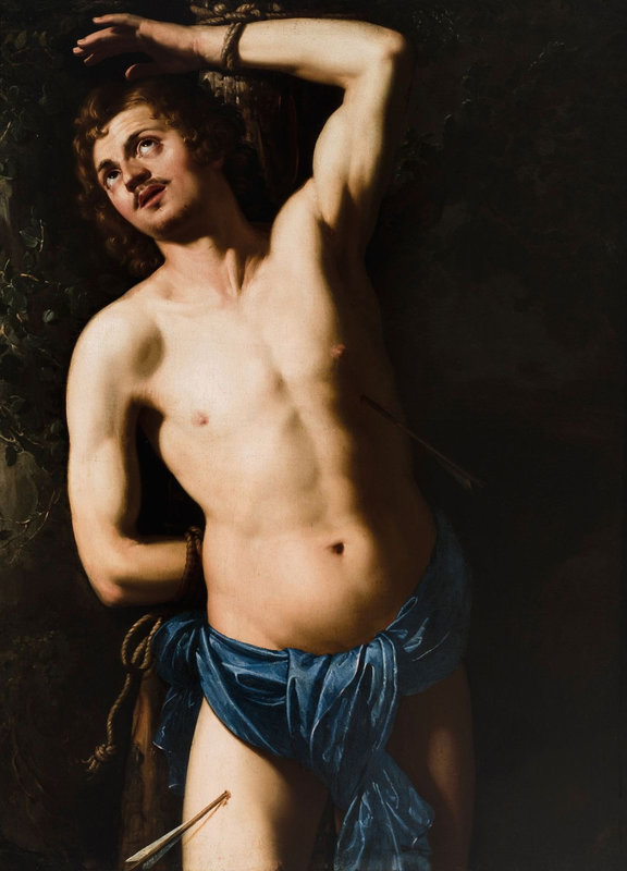
St Sebastian by Theodoor Rombouts (c.1626)
Rombouts was born in Antwerp on July 2nd 1597. He was the son of Bartholomeus Rombouts, a wealthy tailor, and Barbara de Greve. In 1608, at the age of eleven, Theodor studied art for a year as a pupil of Frans van Lanckvelt before being tutored by the Flemish artist, Abraham Janssens, the dean of the Antwerp Guild of St Luke and who had studied in Rome at the time of Caravaggio. He was one of the first Flemish followers of Caravaggio.

Young Soldier by Theodoor Rombouts (1624)
In 1616, aged nineteen, Theodore Rombouts also travelled to Rome where he remained until 1625. He was recorded as living in the Roman parish of Sant’Andrea delle Fratte, along with two other Flemish painters, Francesco Tornelli and Robert d’Orteil. It is thought that while on a visit to Florence he met the Caravaggist Bartolomeo Manfredi and worked for Cosimo II de’ Medici. It was during his stay in the Italian capital that Rombouts was inspired by the revolutionary painter Michelangelo Merisi da Caravaggio and his most important follower Bartolomeo Manfredi and the two would influence Rombouts’ painting style. In 1622 he also travelled to Pisa.
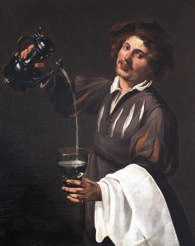
The Cup-bearer (Allegory of Temperance) by Theodoor Rombouts (c.1632)
In 1625, on his return to Flanders, Rombouts entered the Guild of St. Luke in Antwerp as an independent master. Now in Flanders, he concentrated on his genre painting which he could sell at the open market, in a style of strong contrasts of light, with figures of great articulacy, both evoking great energy and yet with natural movement. The excellence of his work and its popularity resulted in him being looked upon as the leading Flemish Caravaggian of his time.
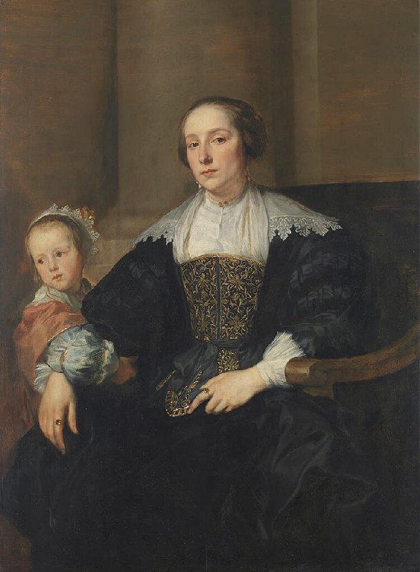
Portrait of Anna van Thielen, wife of the painter Theodor Rombouts with their daughter Anna Maria (c.1630)
In 1627 Rombouts married Anna van Thielen, who was from a noble family and the sister of Jan Philip van Thielen, who was the son of a minor nobleman by the name of Liebrecht van Thielen. Jan Philip became a well-known Flemish painter who specialized in flower and garland paintings. He would eventually assume his father’s title of Lord of Couwenberch. Jan Philip van Thielen became Rombout’s pupil in 1631 and became a talented still life painter. There was a strange twist to Rombout’s marriage as Anna and her family were not from Antwerp but from the Mechelen area, and so he had to obtain, prior to the wedding ceremony, a dispensation from the Antwerp City Council to consummate the marriage outside Antwerp so that he would not forfeit his Antwerp citizenship rights. In 1628 the couple had a daughter, Anna Maria.
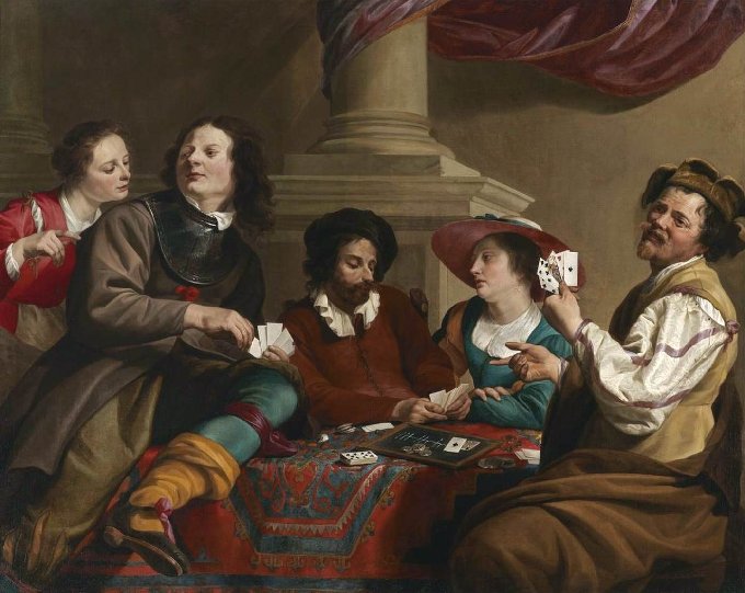
Card Players in an Interior by Theodoor Rombouts
Theodor Rombouts was the primary exponent of Flemish Caravaggism,that became a popular artistic phenomenon that reached its zenith in the 1620s. Besides his religious works, he is probably best known for his large-scale secular works which portrayed groups of cheerful folk partaking in musical merriment and card-playing characters who had often been affected by heavy drinking. These people depicted wearing theatrical costumes were posed for best effect and set in chiaroscuro lighting typical of the Flemish Caravaggisti, also known as the Antwerp Tenebrosi. Tenebrism, from Italian word tenebroso meaning dark, gloomy, and mysterious, also occasionally called dramatic illumination, is a style of painting using especially pronounced chiaroscuro, where there are violent contrasts of light and dark, and where darkness becomes a dominating feature of the image.
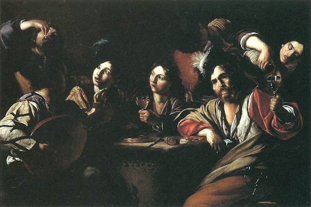
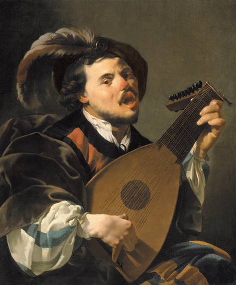
Tavern Scene with Lute Player by Bartolomeo Manfredi (c.1621)
Rombouts’ work entitled Card Players in an Interior, is a prime example of his Caravaggesque genre scenes. Recalling the jovial genre scenes of Bartolomeo Manfredi’s depiction of merriment in a tavern in his 1621 work, Tavern Scene with Lute Player, one can see a similar marked sense of monumentality to Rombouts’ five figures who are positioned around a carpeted table, engaged in a game of cards. The individuals are both realistic and expressive and the whole depiction has natural feel about it.

Rombouts introduces what is known in art terms as repoussoir to the depiction. The word Repoussoir comes from the French verb répousser, which means “to push back” and it has been used for centuries by artists who want to focus attention and add interest to their art. They achieve this by placing certain types of objects or figures close to the painting’s edges, which guide the viewer’s eyes towards your central theme. In this painting our eyes are being led towards the central bearded figure who stares down at his hand of cards, and it is thought to be a self-portrait of Rombouts. Rombouts also included a portrait of his wife, Anna, in the hatted figure seated beside him.

The Backgammon Players by Theodoor Rombouts (1634)
Rombout’s inclusion of self-portraits and portraits of family members in some of his paintings was not unusual as these additions were often seen in Dutch and Flemish genre painting. In his 1634 painting entitled The Backgammon Players, which is part of the collection of the North Carolina Museum of Art, in Raleigh, Rombouts has included himself, the lavishly dressed soldier, his wife and his young daughter.

The Tooth Puller by Theodoor Rombouts (c.1625)
One of my favourite secular painting by Rombouts is his 1625 work entitled The Tooth Puller which can be seen at the Museo del Prado in Madrid. The depiction is of a tooth-puller who is treating a long-suffering patient surrounded by a large group of inquisitive onlookers who could well be the tooth-puller’s next patient. They look on with a mixture of inquisitiveness and alarm, bordering on panic. Like Caravaggio, Rombouts was interested in depicting ordinary folk enduring or enjoying everyday life. The tooth-puller’s certificates lie on the table for his patients to see but his experience is substantiated by a collar of teeth worn around his neck.

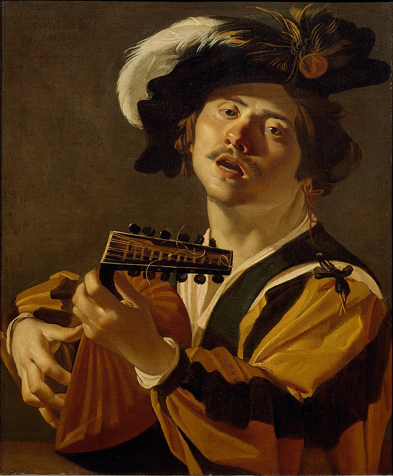
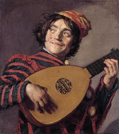
The Lute Player by Theodoor Rombouts (c.1625)
One of Rombouts’ popular single figure painting is The Lute Player which is part of the John G. Johnson Collection at the Philadelphia Museum of Art. It depicts a lute player tuning his instrument. Lute players were often mocked for the undue amount of time they dedicated to tuning their instruments. Look how Rombouts has depicted the intensity of concentration on the face of the street musician which highlights the complexity of the task. Some believe that this tuning of the instrument symbolises striving for harmony in love. The depiction of a stringed instruments could also symbolize temperance, especially when shown in the company of a tankard and a pipe, as depicted by Rombouts.

The Lute Player by Caravaggio (c.1596)
The subject of a lute player was very popular in the seventeenth century and was often depicted in a Caravaggio-style as can be seen in Dirck van Baburen’s 1622 painting entitled The Lute Player or Singing Man with Lute which is part of Centraal Museum in Utrecht collection.
The Lute Player or Singing Man with Lute by Dirck van Baburen (1622)
Von Baburen, like Rombouts, had spent time in Rome and had seen many of Caravaggio’s works of art.
Lute Playing Jester by Frans Hals (1623/1624)
The half-figure image of a single musician became very popular in the Dutch Republic and other artists copied the style such as Frans Hals with his 1623 version of the Lute Playing Jester.
The Singing Lute Player by Hendrick Terbrugghen (1624)
and the Utrecht Caravaggesque painter Hendrick Terbrugghen with his 1624 painting entitled The Singing Lute Player.

Allegory of the Five Senses by Theodoor Rombauts (1632)
In 1632 Rombouts completed his multi-figured work entitled Allegory of the Five Senses which can be seen at the Museum voor Schone Kunsten in Ghent. The art loving public in the 16th and 17th century were fascinated by symbolic works of art especially those where the artist has also displayed his or her virtuosity as a painter. In the painting, Allegory of the Five Senses, we see five men depicted. Each of them symbolizes one of the five senses. The elderly man on the left with glasses propping up a mirror represents Sight. Next to him is a man playing the chitarrone, a type of bass lute, and he symbolises Sound. The blind man in the centre of the painting represents the sense of Touch. Further to the right we see a jovial man with a glass of wine in his hand. He portrays Taste. At the far right we have an elegant young man smoking a pipe and holding a bag of garlic. He represents Smell. The Ghent bishop, Antoon Triest, who also owned several paintings by Dutch masters, purchased this canvas from Rombouts.

The Denial of St. Peter by Theodoor Rombouts (c.1625)
Besides his genre paintings Theodoor Rombouts completed a number of large religious works during his lifetime. Around 1625, after just returning from Rome, Rombouts completed his religious work entitled The Denial of St. Peter. The narrative painting had a wide horizontal format (94 x 206cms) and the depiction was based on the biblical story about the testing of St Peter’s resolve in supporting Christ. In the painting we see the servant girl questioning St Peter. According to the bible Mark 14: 66-70:
“…While Peter was below in the courtyard, one of the servant-girls of the high priest came by. When she saw Peter warming himself, she stared at him and said, “You also were with Jesus, the man from Nazareth.” But he denied it, saying, “I do not know or understand what you are talking about.” And he went out into the forecourt. Then the cock crowed. And the servant-girl, on seeing him, began again to say to the bystanders, “This man is one of them.” But again, he denied it. Then after a little while the bystanders again said to Peter, “Certainly you are one of them; for you are a Galilean…”
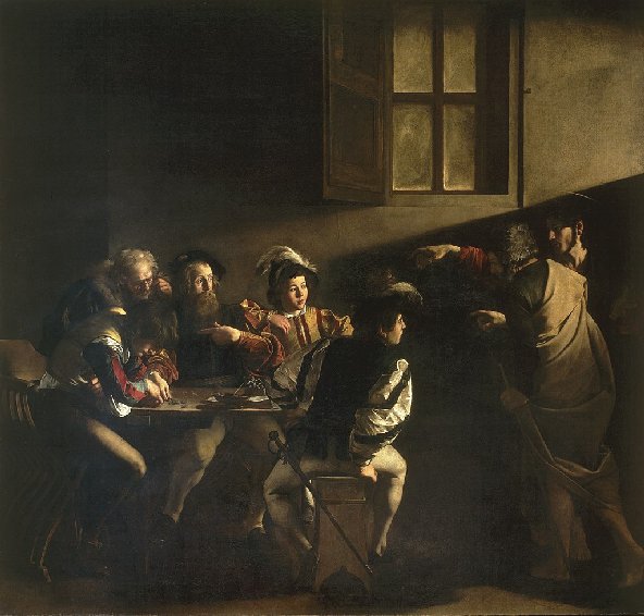
The Calling of St Matthew by Caravaggio (c.1600)
The influence of Caravaggio can be seen in this painting and the setting of the figures reminds one of Caravaggio’s work The Calling of St Matthew which he completed around 1600 and is hanging in the Contarelli Chapel in San Luigi dei Francesi in Rome, and was probably seen by Rombouts.

Christ driving the Money-changers from the Temple by Theodoor Rombouts (c.1637)
Another of Rombouts’ religious works, Christ driving the Money-changers from the Temple, features the events in the Temple as related in Mark’s Gospel (Mark 11:15-17) in the New Testament:
“… On reaching Jerusalem, Jesus entered the temple courts and began driving out those who were buying and selling there. He overturned the tables of the money changers and the benches of those selling doves and would not allow anyone to carry merchandise through the temple courts. And as he taught them, he said, “Is it not written: ‘My house will be called a house of prayer for all nations’ But you have made it ‘a den of robbers…”
It depicts a furious Christ erupting in anger, his self-made whip in his hand, as he furiously attacks the merchants when he discovered that the holy site of the temple was being used as a market hall and money changer’s office. Look at the wide range of emotions etched on the faces of the proponents.
Between 1628 and 1630 Rombouts was deacon of the Guild in Antwerp. In 1635, two years before his death, Rombouts collaborated with other artists on the programme of the decorations of the Joyous Entry of Cardinal-infante Ferdinand in Antwerp, which was led by Rubens. Theodoor Rombouts died in Antwerp on September 14th 1637, aged 40, shortly after the completion of this collaborative project.