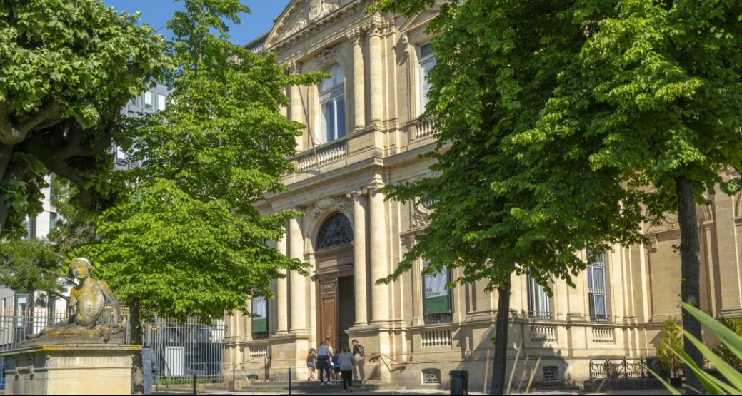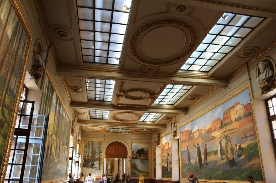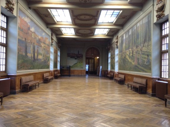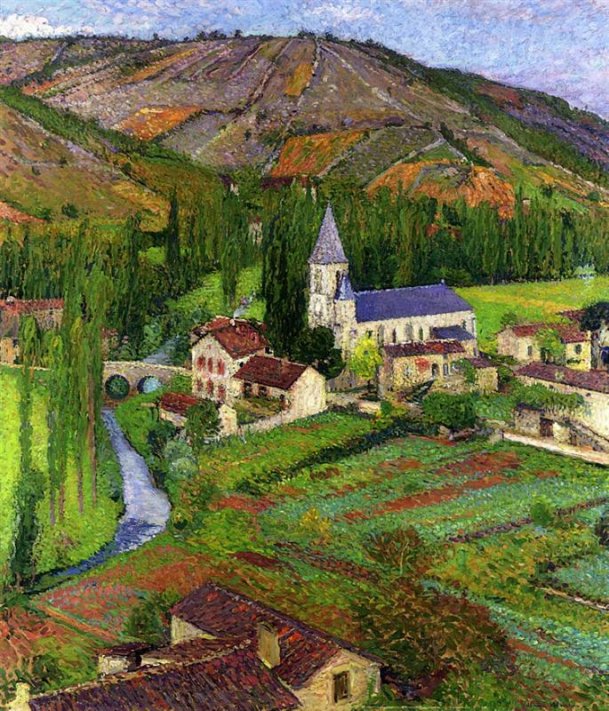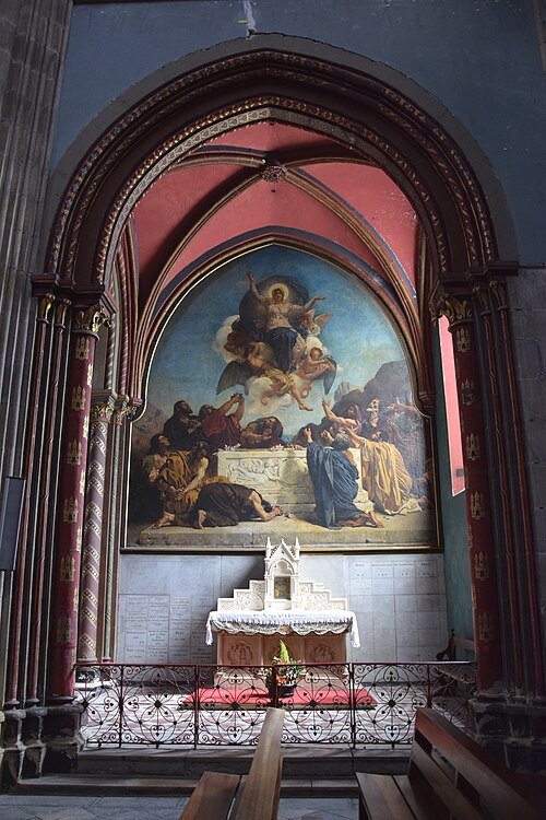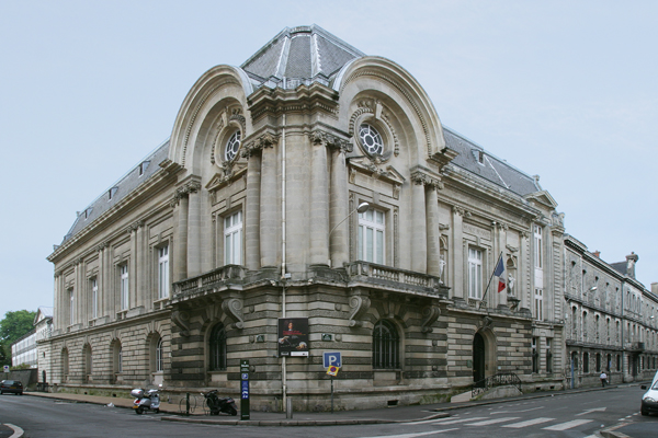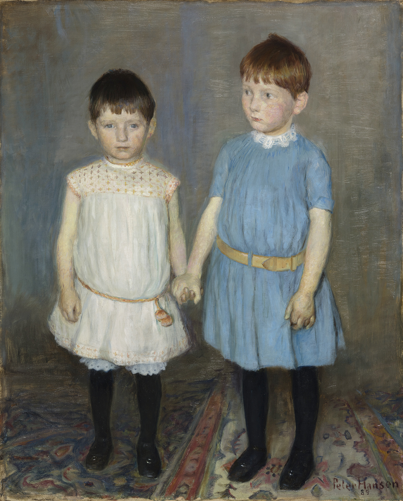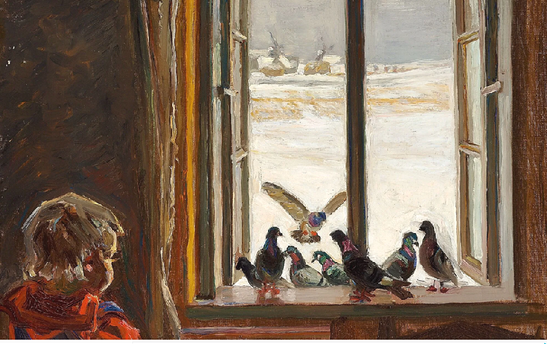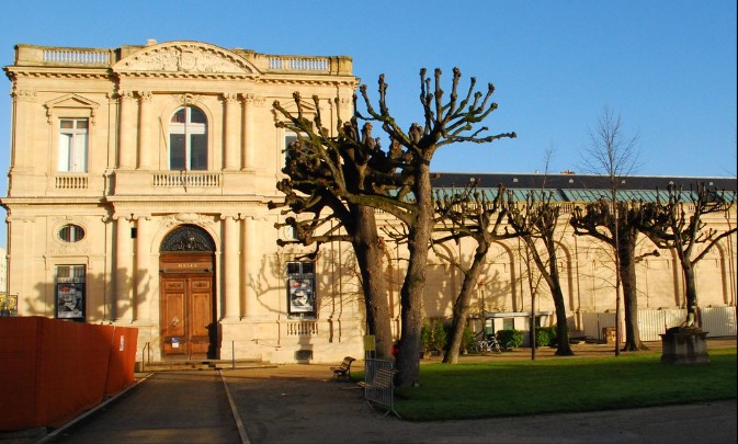
The Bonheur Wing, Musée des Beaux-Arts, Bordeaux.
Behind the Palais Rohan, the seat of the City of Bordeaux whose gardens it shares, the Museum of Fine Arts offers a panorama of the main currents of Western art from the Renaissance to the present day. It occupies two twin wings added to the Palais Rohan in 1851 and opposite, the Galerie des Beaux-Arts completes its permanent collections by regularly hosting temporary exhibitions.
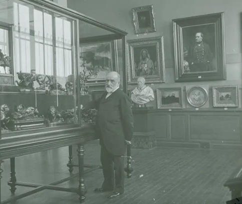
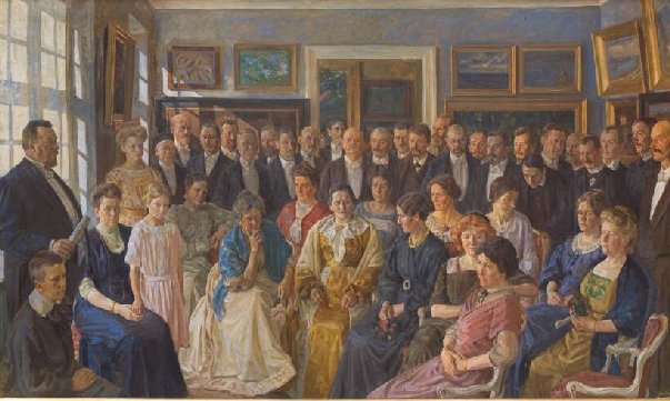
The north wing (Bonheur Wing) is dedicated to modern and contemporary art, presenting the main themes of the 19th Century (romanticism, academicism, and realism), landscapes (Corot, Diaz de la Peña, Boudin), animal paintings (Rosa Bonheur, René Princeteau) and portraits (Thomas Couture, Carolus-Duran, Fantin-Latour and Berthe Morisot).
As the wing of the museum was named to honour the Bordeaux-born artist, Rosa Bonheur, the first couple of paintings in the Bonheur wing of the museum I am showing you are by her or about her.
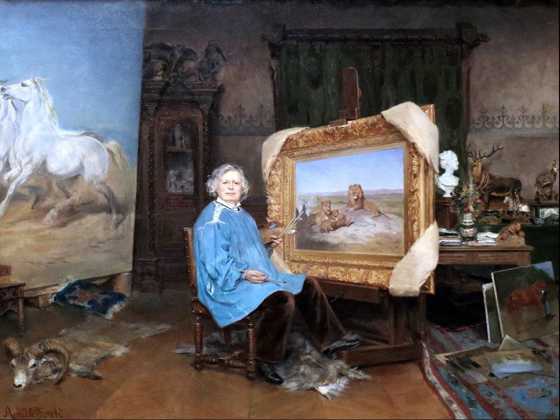
Rosa Bonheur in her studio by George-Achille Fould (1893)
As the wing of the museum was named to honour the Bordeaux-born artist, Rosa Bonheur, the first couple of paintings in the Bonheur wing of the museum I am showing you are by her or about her. Rosa Bonheur was born in Bordeaux on March 16th 1822. She was known best as a painter of animals (animalière). She also made sculptures in a realist style.
This portrait of Bonheur in her studio was painted by Georges Achille-Fould. In the painting we can see a detail taken from her monumental painting, Wheat Threshing in the Camargue. Bonheur can be seen wearing trousers which were forbidden at that time for women. However, Bonheur argued for authorisation from the prefecture to wear them during her drawing sessions at the slaughterhouses! She was passionate about animals, and owned a whole menagerie, including a lion, quails, dogs and even some sheep. For her contemporaries, Rosa Bonheur was truly a phenomenon! Her talent was recognized in 1865 when she became the first female artist to be awarded the Legion of Honour.
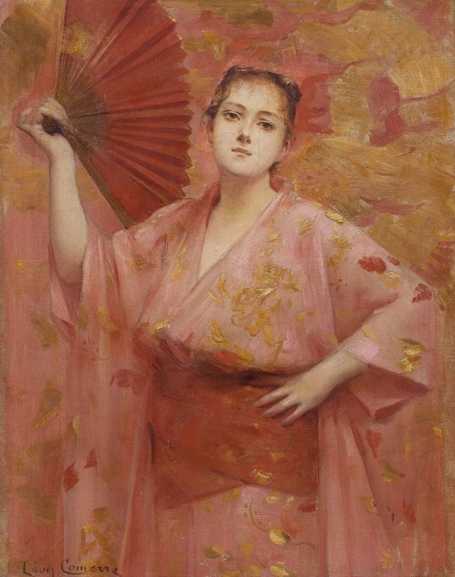
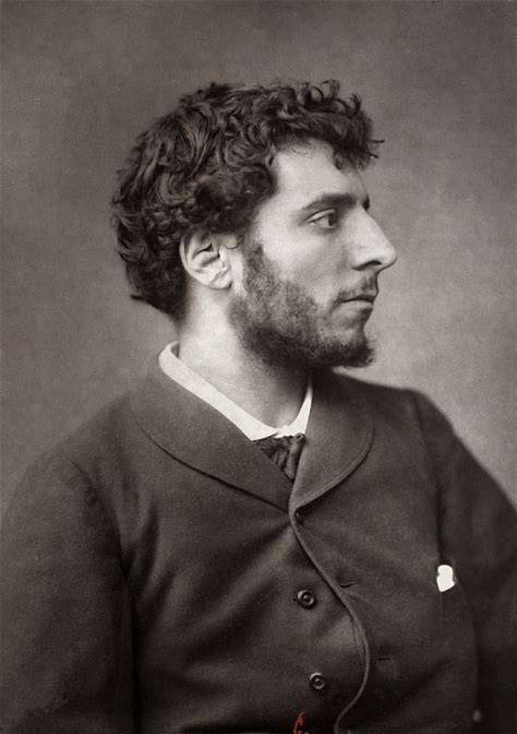
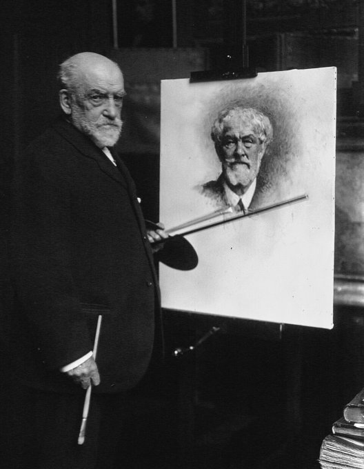
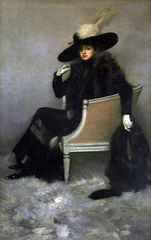
Georges Achille-Fould en japonaise, portrait by Léon Comerre (1863)
The artist who completed this portrait of Bonheur was Georges Achille-Fould. Georges Achille-Fould and her sister Consuelo, both painters, were adopted by Gheorghe Bibescu, who bequeathed to them the Chateau de Bécon, which today houses the Roybet Fould Museum, where numerous works by Consuelo and Fernand Roybet, her tutor, are displayed, alongside many works attributed to Achille-Fould, who signed them simply “Achille-Fould”.
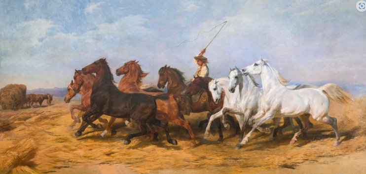
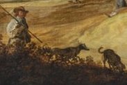
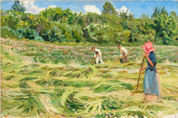
Wheat Threshing in the Camargue by Rosa Bonheur
Rosa Bonheur started on her largest painting, (313 x 651 cm), Wheat Threshing in the Camargue, in 1864 but on her death in 1899, thirty-five years later, it remained unfinished. This is oil on canvas work is the largest format ever painted by the artist and is a genre scene depicting a dozen horses treading wheat in the Camargue. It is said that Rosa’s ideas for the depiction came from her reading the Mirèio, a long poem consisting of twelve songs by French writer Frédéric Mistral, written in 1859 after eight years of effort. It tells of the thwarted love of Vincent and Mireille, two young Provençal people of different social backgrounds. It was a story about a miserly farmer who made his horses work tirelessly at fulling and who was punished by lightning that set fire to his barn and an earthquake that engulfed his family. In her work, Rosa Bonheur wanted to show “the fire that comes out of the horses’ nostrils, the dust that gushes out under their hooves
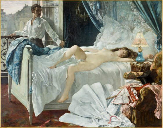
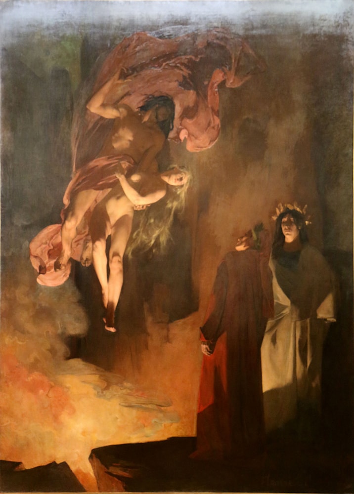
Rolla by Henri Gervex (1878)
Now to a completely different type of painting. Rolla was a painting completed by Henri Gervex and is at the museum but on loan from the Musée d’Orsay, Paris. Gervex was a French painter and was the son of Joséphine Peltier and Félix Nicolas Gervex, a piano maker. When he was 15, a friend of the family helped him get admitted to the atelier of Pierre-Nicolas Brisset. Three years later, he served in the 152nd Battalion of the National Guard. In 1871, aged 19, he was accepted into the École des Beaux-Arts in the studio of Alexandre Cabanel, where he studied for five years. His early work belonged almost exclusively to the mythological genre, which served as an excuse for the painting of the nude, but not always in the best of taste. He had already been awarded a medal at the Salon, which in theory made him an “outsider” in terms of the competition and therefore any painting he put forward to be included at the Salon was guaranteed inclusion into future exhibitions without having to satisfy the Salon jurists. It therefore came as a shock to him to have his painting, Rolla, for the upcoming 1878 Salon, rejected as the authorities deemed the depiction of his painting Rolla to be “immoral”.
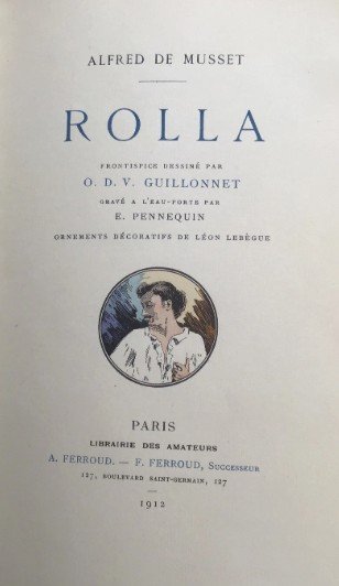
The inspiration for Gerex’s painting came from a long poem by Alfred de Musset entitled Rolla which he completed in 1833. The long poem narrates the story and the destiny of a young bourgeois, Jacques Rolla, who descends into a life of idleness and debauchery. Along the way, he meets Marion, a teenager who has discovered that the life of a prostitute was her only escape from misery. In the painting we see Rolla standing by the window, his eyes turned towards Marion who lies abandoned on the bed. He is desolate and about to commit suicide by taking poison.
Gervex found his inspiration in a long poem by Alfred de Musset (1810-1857), published in 1833. The text recounts
With a melancholy eye Rolla gazed on
The beautiful Marion asleep in her wide bed;
In spite of himself, an unnameable and diabolical horror
Made him tremble to the bone.
Marion had cost dearly. — To pay for his night
He had spent his last coins.
His friends knew it. And he, on arriving,
Had taken their hand and given his word that
In the morning no one would see him alive.
When Rolla saw the sun appear on the roofs,
He went and leaned out the window.
Rolla turned to look at Marie.
She felt exhausted, and had fallen asleep.
And thus both fled the cruelties of fate,
The child in sleep, and the man in death!
So why did the Beaux Arts authorities ban the painting? If the scene had been judged indecent, surely it was not because of Marion’s nudity, which is not unlike the portrayal of nudes by many artists of the time. It appears that the underwear strewn besides the bed denotes Marion’s consent in the sex act and hints at her status as a prostitute. Look at the abandoned clothing and we see a walking stick emerging from the midst of the garments which many believe acts as a metaphor for sexual intercourse.
Following Gervex’s painting Rolla being excluded from the Salon, he exhibited it for three months in the gallery of a Parisian art dealer. The scandal, which was covered in all the newspapers, attracted large crowds to the gallery. In an interview many years later, which was published in 1924, Gervex remembered the pleasure when he witnessed the constant procession of visitors who queued to see the work. Many cynics believed that Gervex had anticipated the reaction to his painting by the authorities and gladly provoked the scandal.
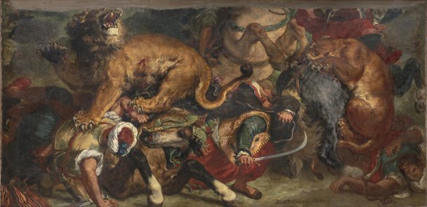
The Lion Hunt by Eugène Delacroix (1855)
In 1855, Delacroix was commissioned by the French State and Napoleon III to produce a monumental work for the that year’s Paris Universal Exposition. Delacroix had studied Rubens’ hunting scenes and was fascinated by the theme of lions. Delacroix often painted hunting scenes and animals fighting. This work is part of a lion hunt series he painted in the 1850s. The subject reflects a fascination for exoticism and the culture of the Muslim countries in North Africa. During a visit to Morocco in the 1830s, Delacroix had studied and made sketches of the landscape, horses and hunters on horseback – themes that were later used when he painted his lion hunts. These dramatic scenes, with their energetic compositions and warm hues, convey the new aesthetic ideals of the time.
The dimensions of his painting, The Lion Hunt, was monumental at 175 x 360cms. Delacroix had spent much time at the Ménagerie part of the Jardin des Plantes in Paris. These regular visits allowed him to capture not just the ferocity of the cats and their musculature, but also the colour of their fur which allowed him to develop a more authentic form of animal paintings.
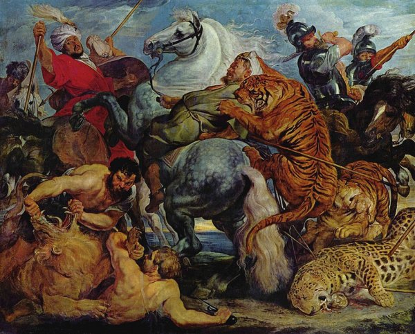
The Tiger Hunt by Rubens (1618)
When Delacroix had completed the painting in 1855 it was deposited at the Museum of Fine Arts of Bordeaux, the city where the painter once lived as a young man when his father was prefect there. Bordeaux was also a city Delacroix occasionally came to pay his respects at the Chartreuse Cemetery, where his father and brother were buried. Bordeaux was also the city in which Peter Paul Rubens had his painting, The Tiger Hunt displayed and which the Bordeaux museum had been exhibiting since 1805, and which is believed to have been a strong influence on Delacroix.
The deputy director and curator in charge of 19th/20th-century collections at the museum, Chloé Theault, believed that the two works would complement each other. The first thing that catches your eye when you study Delacroix’s work is it appears that the top of the painting is missing. In fact, the upper third of it no longer exists, as on December 7th, 1870, a fire ravaged through the town hall in Bordeaux destroying part of the work. The entire upper part of the painting disappeared into the ashes.
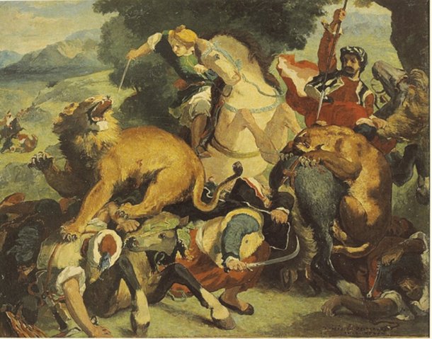
The Lion Hunt by Odile Redon (1860-1870)
Today, some sketches and copies, and notably one by Odilon Redon, exists which allow us to imagine what the upper third of Delacroix’s painting would have looked like with the two missing horse riders that were once in the upper section.
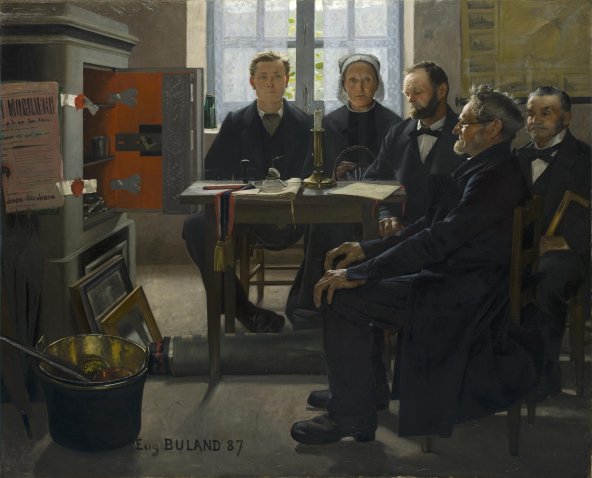
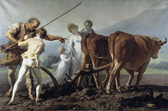
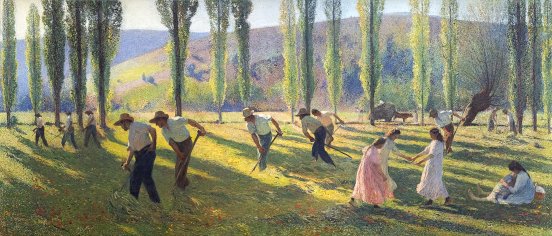
The Heirs by Eugène Buland (1887)
Eugène Buland was born on October 26th, 1852. He was the son of an engraver and entered the École Nationale Supérieure des Beaux-Arts under the tutelage of Alexandre Cabanel. His earliest works were Symbolist paintings of antique scenes, but he quickly turned towards depicting scenes of everyday life. Eugène Buland entered just one painting, The Heirs, at the Salon in 1887 which gained him a second-place medal. It depicts his predilection for subjects taken from daily life in the countryside.
In this figurative work, Buland concentrates on a study of provincial behaviour, conveying the peaceful, quiet lifestyle and the impression of time almost standing still. In the same way as the French writer, Maupassant, Buland tells short stories, novels in his depictions. The strange ambiguity of the scene here is striking. The tight framing of the scene strengthens the almost oppressive atmosphere of this private meeting in which the stone-faced characters, deep in their own thoughts, wait for the will to be read. The touches of red contrast with the dark austere colours and direct our eye towards the open safe, seals, the official banner and finally the will, the focus of everyone’s attention.
Freeing himself from the teachings of his master Alexandre Cabanel, Buland became influenced in naturalism. He was concerned with the detail and drawing inspired by photographic precision which made him a rare artist and a hyperrealist ahead of his time.
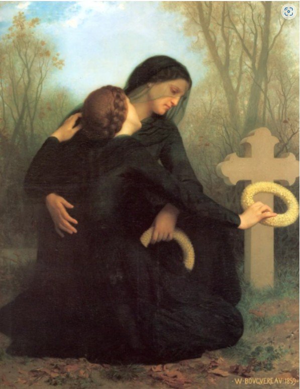
The Day of the Dead by William Bouguereau (1859)
The last selection I am offering you from the Bonheur Gallery of the Bordeaux Musée des Beaux Arts is, like the previous painting, a quietly sombre depiction. There is none of the excitement depicted in the previous seascapes or the savagery of a lion hunt.
The painting entitled The Day of the Dead is by the French academic painter William Bouguereau which he completed in 1859. Bouguereau was born in La Rochelle on November 30th 1825. During his life, he enjoyed significant popularity in France and the United States, was given numerous official honours, and received top prices for his work
The painting The Day of the Dead, depicts a mother and daughter mourning the loss of a husband and father as they kneel at the foot of a tomb. The work captures the essence of the Mexican tradition of Día de Muertos. It is a depiction of death with the black of the mourning clothes, which are illuminated by the luminous yellow of the wreath of immortelles, the cross and winter itself. Bouguereau creates a painting full of restraint, serious and dignified, one of remarkable beauty. With restraint of feelings, the theme conveys an exaltation of the traditional values of the classical cultural ideal and the Christian faith.
The painting was exhibited at the Salon of 1859, this work was the subject of many glowing reviews.