Christmas and Snow

Somebody once said that the only way to enjoy the sight of snow is when looking at a postcard or a painting.  I have spent a number of Christmas Days in hot climes such as Karachi and Melbourne and know that Christmas is not Christmas without snow.  So for this Christmas blog I want to look at some of the beautiful winter landscapes created by famous and not-so-famous artists to remind me of a snowy Christmas, many of which have featured in earlier blogs.

View of Bazincourt, Snow Effect Sunset by Camille Pissarro (1892)

Camille Pissarro depicted the small town of Bazincourt-sur-Epte at all times of the day, and in all seasons, in a number of his paintings.  In 1892 he completed his work entitled View of Bazincourt, Snow Effect, Sunset.  In this Impressionistic-style painting we can see how Pissarro has managed to infuse a warmth to the scene by his use of violet for the trees and the way the sun has illuminated the clouds.

Snow Scene at Argenteuil by Claude Monet (1875)

The great Claude Monet, known for his lily ponds at Givenchy, also painted a number of winter landscapes.  The first one I am looking at is his work entitled Snow Scene at Argenteuil.  Monet and his family moved to Argenteuil a small Parisian suburb twelve kilometres north-west of the heart of the French capital and was accessible from central Paris with a short train ride.  Monet painted many scenes in and around Argenteuil featuring the riverbanks of the Seine, the railway bridge which straddles the French river, which often featuring a steam train chugging across the structure.  The painting I have chosen was one of eighteen that Monet completed which depicted the snowy winter of 1874/5. It is a depiction of the Boulevard Saint-Denis, near Monet’s home. It looks towards its junction with the rue de la Voie des Bans, with the River Seine beyond.  The figures we see in the painting are plodding along the road and it could be that they are making their way to or from the nearby railway station which lies behind the artist.  The station would have been used by holiday makers and commuters on their way from Paris.  The snowy road surface has dark brown furrows made by passing carts and as we follow them we can see the town in the background.  This painting was one of the largest (71 x 91cms) snowscapes that Monet completed but does not have some of the finer details in Monet’s smaller winter paintings.

La Pie (The Magpie) by Claude Monet (1869)

My favourite winter painting by Monet was completed in 1869,  six years before the Argenteuil work.  He painted it during the winter of 1868–1869 whilst he and his girlfriend, Camille Doncieux were living near the commune of Étretat in Normandy in a house Monet’s patron, Louis Joachim Gaudibert, had arranged for them.  This is Monet’s largest (89 x 130cms) winter painting. The painting depicts a solitary magpie which has alighted on a gate which has been fitted between parts of a wattle fence. Sunlight falls upon freshly fallen snow producing blue shadows.   This “blue shadow” phenomenon later became associated with the Impressionist movement artists. Monet and those Impressionists exploited the use of coloured shadows to symbolise the actual, changing circumstances of light and shadow as witnessed in nature, and by so doing, they defied the academic convention of painting shadows black.   However all were not pleased with this new concept which led to its rejection by the Paris Salon of 1869. However present art historians today believe that The Magpie is one of Monet’s best snowscape paintings.  The painting was acquired by the Musée d’Orsay in 1984 and is considered one of the most popular paintings in their permanent collection.

Snow at Louveciennes by Alfred Sisley (1874)

It is believed that due to a series of severe winters in France in the 1870s it contributed to a sudden increase in the number of winter landscapes produced by Impressionists.  My next painting I am showcasing is one created by Alfred Sisley in 1874, entitled Snow at Louveciennes.  Before us we see a picturesque scene of stillness set in early winter’s morning in Louveciennes, a small village in the Île-de-France region in north-central France, located in the western suburbs of Paris, between Versailles and Saint-Germain-en-Laye.  Sisley depicts the sky in white, crisp blue, and grey hues. His use of perspective guides the viewer along a winding road which vanishes into the background.  The buildings in the paintings are covered with snow and we see a lone woman holding an umbrella strolling along the pathway, which has trees on either side. The artist is willing us to take a walk with the woman as she heads towards the village.  Sisley was entranced by views of the countryside during the winter months.  In fact, unlike most of us who dreaded heavy snowfall Sisley was inspired by what he saw and was especially attracted by how the variations in light came into play in snow scenes.


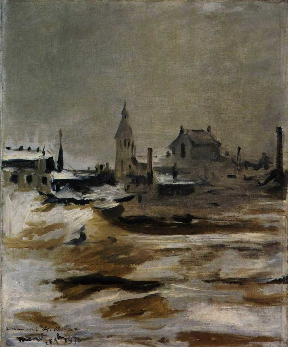
Effect of Snow on Petit-Montrouge by Manet (1870)

The oil on canvas painting entitled Effect of Snow on Petit-Montrouge was painted by Edouard Manet and depicts a winter view of Petit-Montrouge, in the 14th Arondissment of Paris.  Manet completed the work in 1870 whilst he was serving in the National Guard during the 1870–71 Siege of Paris in the Franco-Prussian War. There was no hint of the war, no heroic view of the battle or the bloody fighting, which was raging around the French capital, as often seen in the work of other artists’ paintings of the time.  This painting, although a snowy scene, is awash with shades of brown and black giving it a dark and foreboding ambience which could well be because the way Manet was feeling about the course of the ongoing war.  During this time Manet wrote to his wife:

“…My soldier’s knapsack serves…to hold everything necessary for painting. I shall soon start some sketches from life. They will be souvenirs that will one day have value…”

The painting depicts a view of the church of Saint-Pierre at Petit-Montrouge, and it is inscribed:

“…â mon ami H. Charlet 28 Xbre 1870. Charlet…”

 Charlet is thought to have been a comrade in the National Guard.  The dark image reflects Manet’s loss of hope regarding the impending military defeat and his deep loneliness, the deprivation and his bouts of depression he suffered during this time. It is one of the few landscapes in Manet’s oeuvre and is one of Manet’s first plein air paintings. Today it is in the collection of the National Museum Cardiff.

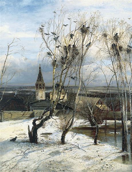
The Rooks have returned by Alexi Savrasov (1871)

Having looked at a painting by Monet featuring a black coloured bird against the white of the snow I had to give you one of my favourite works of art and this too features black birds and snow.  It is not quite a winter scene more “a coming of Spring motif”.  It is Alexi Savrasov’s painting entitled The Rooks have Returned, which I saw at the Tretyakov Gallery when I was in Moscow.  Savrasov was one of the most important, some would say, the most important of all the 19th century Russian landscape painters, and he was  deemed the creator of the “lyrical landscape style”. It is Savrasov’s most famous painting, and the painting is considered by many critics as being the high point in Savrasov’s artistic career.  The depiction witnesses the coming of spring as signalled by the return of the rooks.  The work is testament to Savrasov’s love for the rural Russian landscape, and he was very influenced by John Constable. The depiction we see before us is a simple, and depicts the somewhat inconsequential occurrence of birds returning home in spring to an extremely unpretentious landscape, but it was Savrasov’s way of communicating the change of seasons from Winter to Spring. Simple and yet beautiful.  The great Russian painter, the classical landscape painter, Isaac Levitan commented about its simplicity saying that although the painting was very simple, beneath its simplicity there is the tender artist’s soul, who loves nature and values it.  The painting enhanced Savrasov’s reputation as a landscape painter and it contributed to the success of the first exhibition organized by the Peredvizhniki.

Queue to a Resrvoir by Vasily Perov (1865)

Another depiction of a harsh winter and its effect on the people is Vasily Perov’s work entitled Queue to a Reservoir depicting people in freezing conditions to get themselves some water. It is a reminder of what is happening even nowadays.

Winter Landscape by Caspar David Friedrich (1811) Staatliches Museum, Schwerin.

If your taste in winter landscape paintings is not so much for aesthetic beauty but for depictions that are full of atmosphere then you should look no further than the winter scenes painted by the great German artist, Caspar David Friedrich.  His two Winter Landscape paintings of 1811 relate a poignant story.  One of the works is housed in the Staatliches Museum, Schwerin whilst the other is in the National Gallery, London. In the Schwerin picture, we observe a tiny figure, leaning on a crutch.  He gazes out on a deserted snow-covered landscape.  The sky is coloured grey/black adding to the ominous feel to the work.  The man meanders between dead or dying oak trees, and the stumps of felled trees.  It is a depiction of total barrenness and this bleakness adds to the feeling of hopelessness.  Life for him could not get any worse.

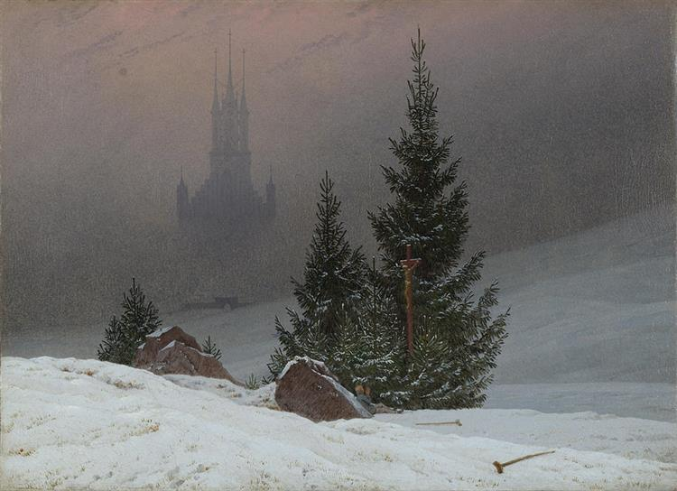
Winter Landscape with Church by Caspar David Friedrich (c.1811). National Gallery London.

However the National Gallery painting, a companion piece to the one in Schwerin, offers us a glimmer of hope for the man. This painting signifies the hope of resurrection through Christian faith. Look carefully at the snow in this work and you will see shoots of grass pushing through the snow and the evergreen trees and faint pink glow of approaching dawn affirm its message of renewal and rebirth. It is a fine example of Friedrich’s use of landscape painting as a vehicle for religious feeling and personal symbolism. As he stated, his aim was not ‘the faithful representation of air, water, rocks and trees … but the reflection of [the artist’s] soul and emotion in these objects.’

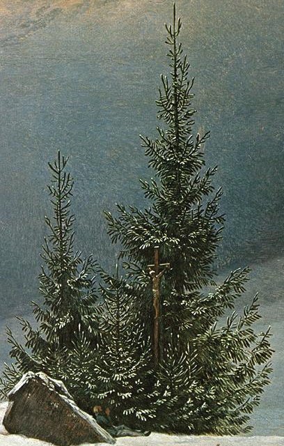
Man praying and abandoned crutches

The painting depicts a man, an invalid, who, in the Schwerin painting, we saw wandering helplessly in the snow, has now thrown away his crutches and lies against a large boulder as he prays in front of a shining crucifix protected by three fir trees, symbolising the Christian Trinity. In the background we see the silhouette of a German Gothic cathedral which is partially covered by a grey mist.  Unlike the hopelessness of the man’s situation in the first painting, Friedrich has instilled a sense of hope of a new life through Christian faith.

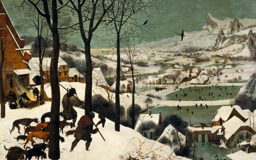
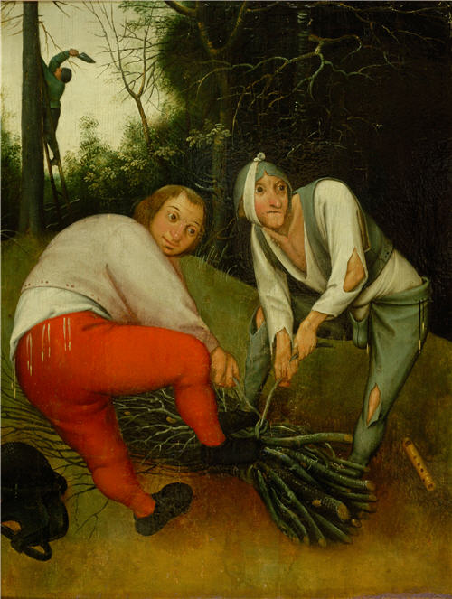
Hunters in the Snow by Pieter Bruehel the Elder (1565)

No compilation of winter landscape paintings would be complete without the inclusion of such works by Pieter Bruegel the Elder.  In 1565 he completed his oil on wood painting entitled The Hunters in the Snow which is also referred to as The Return of the Hunters.  The work is part of the Kunsthistorisches Museum in Vienna, Austria.  It is one of his great genre painting scene with an aeriel viewpoint of a winter’s scene.  The painting was one of a twelve-work series depicting different times of the year and this one is set in the depths of winter during the months of December/January.  Before us we observe a wintry scene and in the left foreground, we see three hunters who are returning from an outing along with their dogs. They are heading down a snow-covered slope towards a small village.  Looking at the men trudging resignedly home with their dogs it appears not to have been a successful hunt with only one of the men carrying over his shoulder one dead fox, the fruit of their labour.  As if to taunt them, there are footprints of rabbits around them, which they failed to ensnare.   It is a cold overcast winters day with little or no wind as we can see by the lack of movement of the wood smoke.  Bruegel has used muted white and grey colours in this composition to give it an air of melancholy.  On the leafless trees we see crows perched on the bare branches. The setting is a flat-bottomed valley through which a river meanders. 

In the background we see an idealised landscape depicting jagged mountain summits which do not exist in Bruegel’s homeland but which would have been seen with him during his time in the Alps.   At the bottom right of the painting we see the large wheel of a watermill which has been frozen stiff.  Below on the frozen lake people are ice skating.  To the returning hunter’s left we can see an inn with villagers preparing a roaring fire in preparation of roasting a pig.  The sign on inn is hanging askew.  The image on the sign depicts a stag named Saint Hubertus, who is the patron saint of hunters. The words are in Dutch, Dit is Guden Hert, which means in English “This is the Golden Deer”.

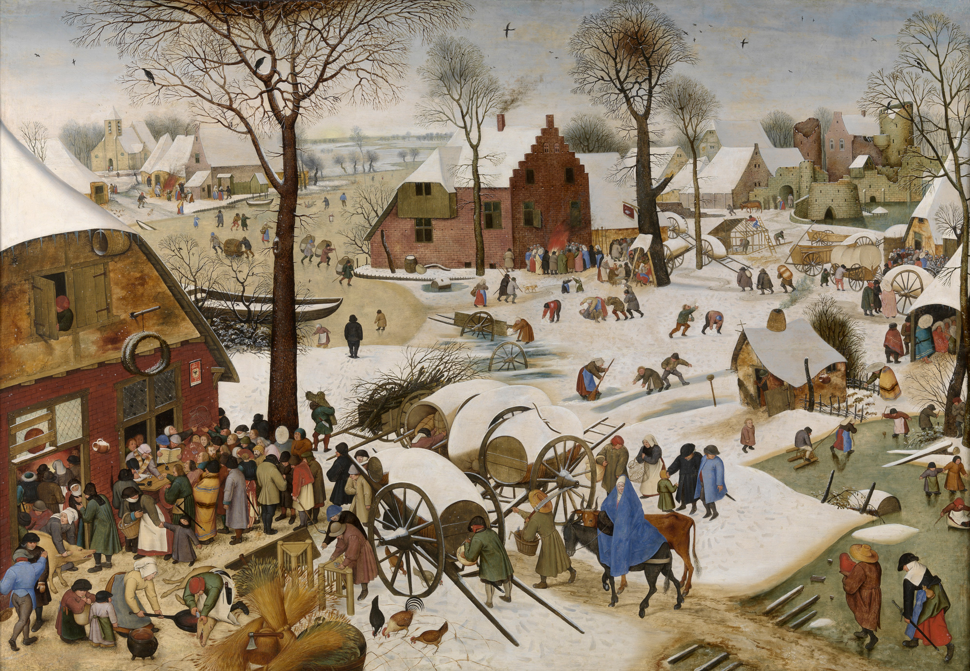
The Census at Bethlehem by Pieter Bruegel the Elder (1566)

Another winter painting by Bruegel the Elder is his 1566 work entitled The Census at Bethlehem, also known as The Numbering at Bethlehem.  It depicts the collecting of names of the villagers so as to enforce a tax collecting regime.  Bruegel would have painted this following the harsh winter of 1565.  In this work Bruegel depicts a scene which pre-dates the Nativity and the birth of Christ. The scene before us takes inspiration from the Gospel of Luke, chapter 2, verses 1 to 5.

“…In those days a decree went out from Emperor Augustus that all the world should be registered in their own towns. Joseph also went from the town of Nazareth to the city of David called Bethlehem … with Mary with whom he was engaged and who was expecting a child…”

Although the story behind the painting is set in the Holy Land, Bruegel Bruegel combines this biblical narrative with life during his own time.  He has set his work in a Flemish village in winter at sunset with the ruined castle in the right-hand side of the background being based on the towers and gates of Amsterdam. People are gathered at a building on the left registering their details.  We can just about make out the Habsburg double-headed eagle on a sign on the building.  Villagers are streaming towards the census point, two of whom are Joseph and the Virgin Mary, who is with child, riding on a donkey. People are mingling in the cold, and we see happy children playing with toys on the ice and having snowball fights. There is the strange sight of a spoked wheel at the centre of the painting and this has occasionally be deemed to symbolise the wheel of fortune. To the right, a man in a small hut is shown holding a clapper, a warning to keep away from leprosy. Leprosy was endemic in that part of Europe when the painting was created. There is a begging bowl in front of the hut. In the background, men drink at a makeshift bar, and in the distance we see a well-kept church and a crumbling castle.

Bruegel once again treats a biblical story, in this case, the Census of Quirinius, as a contemporary event. He wants to liken the harsh events of the Roman occupation with the severity of the Spanish administration, who at Bruegel’s time, were ruling the southern Netherlands.  It is also thought that Bruegel was condemning the bureaucracy he was having to fight on a daily basis.

Census at Bethlehem by Pieter Bruegel the Younger (c.1590)

Pieter Brueghel the Elder’s son Pieter Bruegel the Younger and his studio made dozens of copies of his father’s painting after he died in 1569.  One, thought to be completed before 1600, was sold at auction for $10 million in 2013. One other copy, dated from 1610, is also at Royal Museums of Fine Arts of Belgium in Brussels.

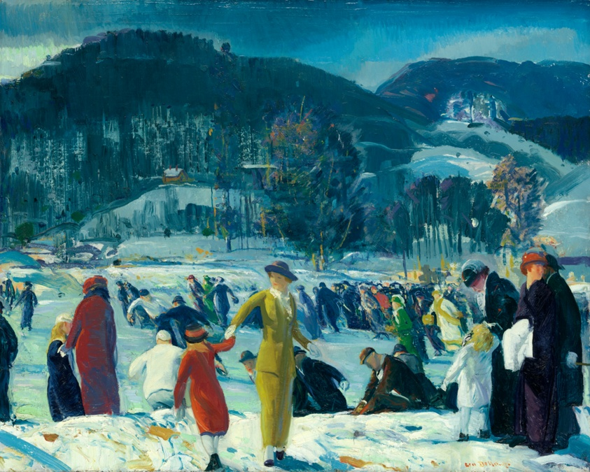
Love of Winter by George Bellows (1914)

I will almost end this compilation of winter scenes by highlighting two works completed by the distinguished American artist, George Bellows.  George Bellows was born in Columbus, Ohio in 1882 and after passing through the various school years arrived at Ohio State University at the age of nineteen.  It was here that his sporting prowess came to the fore and at one time it was thought that he may take up baseball professionally.  During his time at the university, he funded himself by working as a commercial illustrator.  However, Bellows had one aim in life and that was to become an artist, so much so, that he quit the university just before he was due to graduate and moved to New York to study art.

He enrolled in the New York School of Art and became a student of Robert Henri.  It was through Henri that Bellows came into contact with a group of artists known as The Eight and later became part of  The Ashcan School.  The Eight was a group of artists whose fame derives from, and for what they will always be remembered for, their one and only joint exhibition in 1908 at the Macbeth Gallery in New York.  The exhibition was a sensation and it is now looked upon as one of the most important events in the development of twentieth-century American art.

It is said that Bellows wrote to a friend in January 1914:

“…There has been none of my favourite snow. I must always paint the snow at least once a year.”

Unknown to him these were prophetic words as on February 13th 1914 New York City was hit by a major blizzard and it was this occurrence which led to Bellows painting his famous 1914 work entitled Love of Winter.  The whole winter scene was intensified by Bellows with his use of bright reds, yellows, and greens and the feel of movement in the painting is achieved by his broad slashing brushstrokes.  The enthusiastic group of skaters and onlookers of differing ages, differing social classes echoes the diverse populations who appreciated  the public parks and the leisure activities on offer to them in early 20th-century New York City.

Blue Snow, The Battery by George Bellows (1910)

His other snow scene I wanted to show you is entitled Blue Snow, The Battery which he completed in 1910.  The setting for the painting is Battery Park which lies adjacent to the financial district of Manhattan.  There is a breathtaking beauty about this work of art.  His imaginative and powerful use of blue energizes the scene of the southern tip of Manhattan.  Bellows painted a number of scenes with New York City under snowfall and as with this work it is amazing how he has developed a strong sense of light and visual texture contrasting the white and blue of the snow and the dark grimy outline of the old buildings.  It is a beautiful strong composition which is normally housed at the Columbus Museum of Art.

Winter Landscape by Wassily Kandinsky (1909)

The inclusion of a blue tint in the depiction of the snow gave Bellows’ winter scene a colder ambience. Snow is white but a tinge of blue adds to its portrayal but what about other colours for snow? Wassily Kandinsky’s painting Winter Landscape is one of the works in which the individualities of the artist, who was one of the founders of abstract art, are shown in the full extent. The motif of thin black trunks is often used by Kandinsky in his landscapes. Bright colouring with predominant pink, yellow, blue and black is based on immediate visual impressions: the artist seeks to convey various light effects in the snow illuminated by the setting sun. Kandinsky explained his choice of colours:

“…Colour provokes a psychic vibration. Colour hides a power still unknown but real, which acts on every part of the human body…”

Your thoughts ?

I hope you enjoy this over-long blog but it is holiday time and hopefully you have plenty of time to read it. I end by wishing you a Happy Hanukkah, A Happy Christmas and a peaceful and prosperous New Year.

Jonathan

The Barber Institute of Fine Arts. Part 1.

I had a short city break in Birmingham the other day when I had intended to visit some of the main art galleries.  Unfortunately, the main Birmingham Museum and Art Gallery in the centre of the city was closed until late April, for essential electrical works and so I was able to concentrate my cultural journey on a visit to the Barber Institute of Fine Arts at the centre of the Birmingham University Campus.  I had been here once before, five years ago and especially fell in love with two of the paintings.   The Barber Institute is a smaller gallery in comparison to the main one in the Birmingham centre and yet it is full of artistic treasures by the most famous artists.  In my next three blogs I will introduce you to and tell you about some of the wonderful paintings in their permanent collection, so as to tempt you to visit the museum.

See the source image
The Barber Institute of Fine Arts, Birmingham, England.

The Barber Institute of Fine Arts is housed in one of Birmingham’s finest Art Deco buildings and was opened in 1939.  The architect tasked with designing the building was Robert Atkinson, one of Britain’s leading architects of the 1920s and ’30s. The building is laid out around the central music auditorium, surrounded by corridors. On the Ground floor these form offices and lecture halls for the Departments of Music and History of Art, as well as a dedicated Art History library. The galleries occupy the same space on the first floor, approached by a stunning travertine staircase directly opposite the entrance.

See the source image
Ramsau by Thomas Fearnley (1832)

The first painting I want to present to you is one of my all-time favourite landscape works.  The 1832 work, entitled Ramsau, is by Thomas Fearnley.  Fearnley was born in Norway, but studied abroad, often with his fellow countryman Johan Christian Dahl.  It was whilst working alongside Dahl that Fearnley developed the habit of painting directly en plein air.  Fearnley was travelling to Italy when he and his party stopped at the village of Ramsau, a small town located on the Königssee in the district of Berchtesgadener Land in Bavaria.  In the painting we can see the road winding and disappearing around a corner of the village before we catch a glimpse of it again as it heads off towards their destination, the snow-covered Alps and the beautiful snow-capped Hoher Göll, which straddles the border between the German state of Bavaria and the Austrian city of Salzburg.    It is such a beautifully tranquil scene.  In the middle ground of the depiction, we see a lone farmer collecting hay.  Such hard work was so important so as to have food for his animals during the harsh and bitterly cold winter, which was fast approaching.  This en plein air work would have taken Fearnley several sittings during the week-long stay, on each occasion adding another layer of colour.

The Wrath of Ahasuerus by Jan Steen (c.1670)

I have always loved the works of the Dutch Golden Age painter, Jan Steen, so I was pleased to see one of his works in the Barber Institute’s collection.  It was not one of his exuberant genre scenes but a Biblical painting.   It was his painting The Wrath of Ahasuerus which he completed around 1670.  The characters who appear in the painting come from the Old Testament Book of Esther.  The depiction before us is an episode in the life of the Persian king Ahasuerus and his Jewish wife Esther.  King Ahasuerus had sought a new wife after his queen, Vashti, had refused to obey him, and Esther, the adopted daughter of the Jew Mordecai, was chosen for her beauty.  The subject of the painting is from Esther vii, 1-7.  Haman, the king’s First Minister had issued a decree that all the Jews in Persia should be killed.  Esther, the wife of the king, held a banquet and at it she confessed that she was a Jew, and that she too was threatened by Haman.  So we see in the painting, on hearing what his wife had to say about Haman, her husband jumps up in a violent reaction to what he has just heard.  Ahaseurus explosive and exaggerated gesture, eyes bulging, red in the face, fists clenched, jumps up knocking over a vase and the peacock pie.  Haman, on the left, cowers away from the king’s fury. The peacock is a symbol of pride and is a reference to Haman’s fallen pride and his downfall.  The king ordered Haman to be hung.  This story of Esther’s triumph over the evil Haman was popular with the Dutch people who could see the similarity between her battle and their plight against the mighty, and in their eyes, the evil Spanish invaders and occupiers of their country, being a similar story.

Symphony in White, No. III
Symphony in White No. III by James McNeill Whistler (c.1867)

James McNeill Whistler completed Symphony in White No. 3 in 1867 and it is now part of the Barber Institute collection.  It was thought to have been originally entitled Two Little White Girls.   Two women are depicted in the painting.  One, sitting on a sofa, is Joanna Heffernan, Whistler’s mistress.  The other, resting on the floor in the cream/yellow dress, is Millie Jones, the wife of an actor friend.  Laying on the floor is an Oriental fan which is a reminder of the popular Japonisme cult of the time.  Japonisme was a French term that referred to the popularity and influence of Japanese art and design among a number of Western European artists in the nineteenth century.  Whistler had embarked on this painting in July 1865 and within a month, he had completed the preliminary sketches and by September he had completed the work and had signed and dated it. 

However, he was not happy with what he saw and began to rework it and Whistler was not finally satisfied with it until 1867 when it was exhibited at the Royal Academy. He painted over the final “5” in the original date, and replaced it with a “7”, to mark the changes it had undergone.   

Whistler chose the term ‘Symphony’ to highlight to visitors to the exhibition that it was purely a study in colour and the connection of two branches of the Arts, music and art..  It was the first of Whistler’s paintings to be exhibited with a musical title.  And so, why was it entitled “No. 3”? 

See the source image
Symphony in White. No 1. by Whistler. NGA Washington.

The reason behind this numerical conundrum was that Whistler’s 1863 painting was given the title White Girl but Paul Mantz, a French art historian and writer for the Gazette des Beaux-Arts, called it ‘Symphonie du blanc‘, and so it was later renamed Symphony in White. No. 1. 

Symphony in White No.2 by Whistler. Tate Britain.

In 1864 Whistler completed a second similar work entitled The Little White Girl, which later became known as Symphony in White. No. 2.  In their 1908 biography of Whistler, The Life of James McNeill Whistler, Elizabeth and Joseph Pennell, make the point that this may have been a factor that influenced Whistler in his choice of titles for the third in the series. 

Edgar Degas - Portrait de Mlle Eugénie Fiocre in the Ballet "La Source"
Portrait de Mlle Eugénie Fiocre in the Ballet “La Source” by Degas (1868). Brooklyn Museum.

The work was greatly admired by all who saw it.  It is thought that Deagas drew inspiration from Whistler’s painting when he worked on his painting, Portrait de Mlle Eugénie Fiocre in the Ballet “La Source”

However, there were some critics who were not altogether in love with the work.  Philip Hamerton, an English artist, art critic and author, writing for the Saturday Review on 1 June 1867, remarked:

“…In the “Symphony in White No. III.” by Mr. Whistler there are many dainty varieties of tint, but it is not precisely a symphony in white. One lady has a yellowish dress and brown hair and a bit of blue ribbon, the other has a red fan, and there are flowers and green leaves. There is a girl in white on a white sofa, but even this girl has reddish hair; and of course, there is the flesh colour of the complexions…”

Whistler was horrified by what had been written in the journal and wrote a letter to the editor but he would not print it.  However in Whistler’s own book, The Gentle Art of Making Enemies, he reproduced the letter in which he had written:

“…How pleasing that such profound prattle should inevitably find its place in print!…Bon Dieu! did this wise person expect white hair and chalked faces ? And does he then, in his astounding consequence, believe that a symphony in F contains no other note, but shall be a continued repetition of F, F, F ? . . . Fool!…”

Two Peasants binding Faggots by Pieter Brueghel (c.1615)

For my last offering in Part One of my blog relating to my best-loved works in the collection of the Barber Institute I have reverted to one of my favourite painters, Pieter Brueghel the Younger.   He was the son of one of the greatest sixteenth century artists, Pieter Bruegel the Elder, and the brother of Jan Breughel.  This amusing and fascinating painting entitled Two Peasants binding Faggots, was completed around 1615, and it was the type of work which was popular in the seventeenth century.  It was entitled Two Peasants binding Faggots. It is a depiction of peasants binding a bundle of stolen branches for firewood whilst their fellow accomplice is seen in the background cutting the branches of a tree.  The two peasants in the foreground glance around furtively and from that we gather that they are up to no good,  The larger of the two, on the left, is stout symbolising the sin of gluttony whilst his thinner and gaunt accomplice with a paler face and wearing a codpiece has a bandage around his head and it is thought that Brueghel has depicted this as it relates to the Flemish proverb “to have toothache behind the ears” meaning a malingerer. On the ground, next to the gaunt-looking man, is a pipe which is a traditional phallic symbol and represents the sin of lechery.

Bruegel Netherlandish Proverbs@0
Netherlandish Proverbs by Pieter Bruegel the Elder (c.1525). Staatliche Museen Berlin.

The artist’s father, Pieter Bruegel the Elder, had painted a large work, Netherlandish Proverbs, in 1559, which featured a large number of similar characters each representing various Netherlandish proverbs which today is part of the Staatliche Museen collection in Berlin.

…………….to be continued.

The Procession to Calvary by Pieter Brueghel the Younger


The Procession to Calvary by Pieter Brueghel the Younger

The elder son of Pieter Bruegel the Elder’s was also named Pieterand was just five years of age when his father died in 1569.   The death of his father left Pieter, his young brother Jan and sister, Marie to be brought up by their mother Mayken Cooke van Aelst.  After their mother died in 1578 the two boys went to live with their maternal grandmother Mayken van Hulst, who was an accomplished miniaturist and watercolour painter in her own right.  It is from her that the boys received their initial artistic tuition.  Very little has been written about Pieter Brueghel but Karel van Mander a Flemish-born Dutch painter and poet, who is mainly remembered as a biographer of Netherlandish artists and was a contemporary of Pieter Brueghel the Younger, records that when Pieter was nine years of age the family moved to Antwerp and it is believed that here, Pieter received his first formal artistic training under the tutelage of the Dutch landscape painter, Gillis van Coninxloo III.  When he was twenty years old he became a member of the local Guild of Saint Luke and was registered as an “independent master”.  In comparison to his younger brother, Jan, Pieter was less successful as an artist.  He ran a studio, which had many apprentices, including Frans Snyders, who was to become one of the foremost Netherlandish painters of animals and still-life.  The problem for Pieter was that his paintings although they sold well, were sold cheaply.  The main reason for this was the fact that a lot of his works were copies or imitations of his father’s works.  Art critics have pointed out that his works had neither the depth of his father’s works nor the refinement of the works of his younger brother Jan.

At the end of 1588 when he was twenty-four he married Elisabeth Goddelet and the couple went on to have seven children.  Pieter Brueghel the Younger painted landscape and religious paintings as well as his fantasy paintings in which he liked to depict hobgoblins, fires, and other grotesque figures and it was his love for this sort of work which made him known as “Hell Brueghel” in stark contrast to the nickname, “Velvet Brueghel” given to his brother Jan for his concentration on still-life flower paintings.  Pieter Brueghel and his apprentices spent a lot of time copying his father’s works of art.  He and his studio produced more than sixty copies of his father’s 1565 painting entitled Winter Landscape with Skaters and a Bird-trap.   Pieter Bruegel the Elder’s painting entitled The Adoration of the Magi in the Snow, which he completed in 1567, was copied by his son in 1600 and was just one of almost thirty copies of the painting which came from the studio.   A painting simply entitled Proverb,s which can be found at the Rockox House museum in Antwerp is a copy of his father’s 1559 painting Netherlandish Proverbs which is housed at the Staatliche Museen in Berlin.  A great number of his paintings featured peasants and their daily lives, just as his father had done years earlier.

My featured painting today is one which Pieter Brueghel the Younger completed in 1607 entitled The Procession to Calvary.  It is a prime example of young Pieter Brueghel attempt to copy one of his father’s great works of art of the same name which was completed in 1564.  The painting which was owned by Lord St Oswald had hung at the family seat of Nostell Priory in Wakefield, West Yorkshire for over two hundred years.  However although the building is now owned by the National Trust the contents belong to the St Oswald family and they wanted to sell the work.  Through the auspices of the Art Fund, The National Heritage Memorial Fund and various monies received from the public, trusts and other foundations the painting was bought for £2.7 million and will now remain at the Priory.

The painting is deemed to be one of Brueghel the Younger’s best works.  His setting for the biblical scene illustrating Christ’s journey to his own crucifixion atop Mount Calvary is a Flemish landscape and is full of fascinating details. The background of the painting is a vast landscape with a river estuary slowly meandering towards the open sea which we can just see on the horizon.  In the left mid-ground we see a city with all its multi-storeyed buildings.  This is not a mystical biblical city from the Middle East but a European cityscape.  I love the details the artist has given the buildings.  People of Flanders who saw the painting could relate to the scene.  Brueghel has not only painstakingly depicted the city but he has spent much time depicting the people and the everyday objects that he has included in the painting.

Look to the right and you can see a troop of soldiers leading the procession up the hill , escorting Christ on his last journey.  Note their armour.  It is modern.  This is not a depiction of Roman cavalry.  This is a depiction of the troops of the Spanish army similar to the ones who had sacked Antwerp in November 1576 when Pieter Brueghel the Younger was just twelve years of age.  Maybe the atrocities of the war between the Catholic Spanish and the Protestant Netherlands affected the young boy and his painting is not just a tale of Christ’s suffering at the hands of the Romans but a tale of his people’s suffering at the hands of the Spanish.

If we look to the top of the hill we do not just see the three traditional crosses which were part of the biblical tale.  What we see is a mish mash of gallows and gibbets.  These would not be unusual sights set outside the city walls at the time of Brueghel.  Public executions were quite common at the time in the Netherlands and as in the days of Christ’s crucifixion, such executions were often attended by the local population.  Ahead of the Spanish troops we can just make out the two thieves being transported in a cart towards the top.  Unlike the biblical tale of the two thieves carrying their crosses like Christ, Brueghel has shown them being moved in carts, which was how those who were to be executed in Brueghel’s day were moved towards their place of execution.

It is also interesting to note how Brueghel has depicted Christ bearing his cross.  He is just a non-descript figure dressed in grey and hardly stands out from the crowd.  He is not the centre of attention in this sprawling painting and yet he has the leading role in the story.  What of the onlookers?  Are these all depicted as wracked with grief mourning the imminent death of Christ?  I would suggest that Brueghel has portrayed the scene differently from what we are used to seeing.  I believe there is a passive air about the crowd which maybe reflects more the contemporary Netherlandish life when executions were commonplace and caused little outpourings of grief except from the immediate next-of-kin.   This is more of an everyday scene than a portrayal of the events of Good Friday.

Take a look at this painting and compare it with the one done by his father which I featured in My Daily Art Display of March 7th.  See which you prefer.

The Parable of the Blind by Pieter Bruegel the Elder

The Parable of the Blind by Pieter Bruegel the Elder (1568)

Yesterday when I featured the painting by John Singer Sargent, entitled Gassed, I was immediately reminded of a painting by one of my favourite artists, the Flemish genius, Pieter Bruegel the Elder.  His painting was entitled The Parable of the Blind and he completed it in 1568 a year before his death.   Breugel at the time of the painting was about forty three years of age.  His date of death is known to be 1569 but his date of birth is only approximated as being between 1525 and 1530.  He was by the time he completed this work of art a well established and well respected painter.

The title of Bruegel’s painting derives from a passage in the New Testament (Matthew 15:14) in which Christ is comparing spiritual blindness to physical blindness and talking about inner blindness to religion of some people.   It all came about as Jesus had told his disciples that it was not necessary to wash hands before eating. This remark was overheard by the Scribes and Pharisees and they were infuriated, as it was a patent infringement of Jewish law. When the disciples reported this to Jesus, he replied:

“…They are blind guides leading the blind, and if one blind person guides another, they will both fall into a ditch….”

Before us we see a line of six men walking along a dirt track.  They are a bunch of unkempt, unshaven peasants.  They are painted in a frieze-like procession and the line of men surges diagonally, top left to bottom right of the painting which otherwise had been beautifully balanced both horizontally and vertically.   They move together in a group ensuring they do not lose contact with each other as they can be seen holding the same stick in pairs or in some cases each has a hand on the shoulder of the man in front.  However their strategy did not work and we see that the leading blind man has fallen into a ditch and the second man in the line is now tripping over his fallen leader.

The second man

Look at the fear in the face of the second man as starts to fall.  As we look at the figures we know that their forward motion is unstoppable and we are all fully aware of what is likely to happen next.  The fallen leading man and the stumbling of the next two disrupt the calm and tranquil Brabant landscape.

I love how Bruegel has depicted the expressions on the men’s faces.  The mouth of the second man is open and he is probably shouting out a curse as he stumbles over the legs of the leader who lies on his back in the ditch bemoaning his fate.  The third man has a look of horror on his face as he feels the stick he is holding with the second man is suddenly tugged forward.  The three men at the rear have yet to stumble but are no doubt alarmed by the cries from their forward colleagues.

The fourth man blindly looking to heaven

The fourth man looks upwards with blind eyes maybe praying for help.

The church in the background shows a likeness to the Sint-Anna church in the village of Sint-Anna-Pede but art historians do not believe that the background is an actual landscape but that Bruegel had painted and idealised landscape taking little bits of different locations and merging them.  Look closely at the line of men.  Look how there is a gap between the second and third man and in that gap we have a clear sight of the solidly-built church.  Was this intentional?  If so what meaning should we put on this aspect of the painting?  Could it be that the artist is comparing the solid structure of the church as a solid faith in God in comparison with those people who do not want to see or acknowledge God and this Bruegel depicts by painting the blind men stumbling along the path they have chosen, similar to the stumbling of people who choose a path in life without their God.?  We see the brilliance of Bruegel’s art as he depicts the men in various stages of falling and one must marvel at the expressions on the various men’s faces.  The expressions on the faces range from trust to surprise and shock.

The Pieter Brueghel the Younger version

It is a beautifully crafted painting and it is interesting to note that Bruegel’s elder son, Pieter Brueghel the Younger, made a copy of his father’s painting soon after his father died.  The same six blind men stumble along, some of whom have been given lighter-coloured clothing and in this picture we see animals and fowl in the well preserved field in front of the church in comparison to the desolate looking field in his father’s painting.