

Museo Thyssen-Bornemisza, Madrid
The artist I am featuring today is the early Netherlandish painter Joos van der Beke, better known as Joos van Cleve because he is thought to have been born in the Lower Rhine region of Kleve, possibly the Rhine-river town of Wesel, which lies on the current Dutch-German border. The year of his birth is believed to be around 1485. There are various accounts of his early life, much of which are contradictory, but it is thought that his initial artistic training began when he worked in the Kalkar studio of the Dutch painter, Jan Joest van Kalkar, between 1505 and 1509.
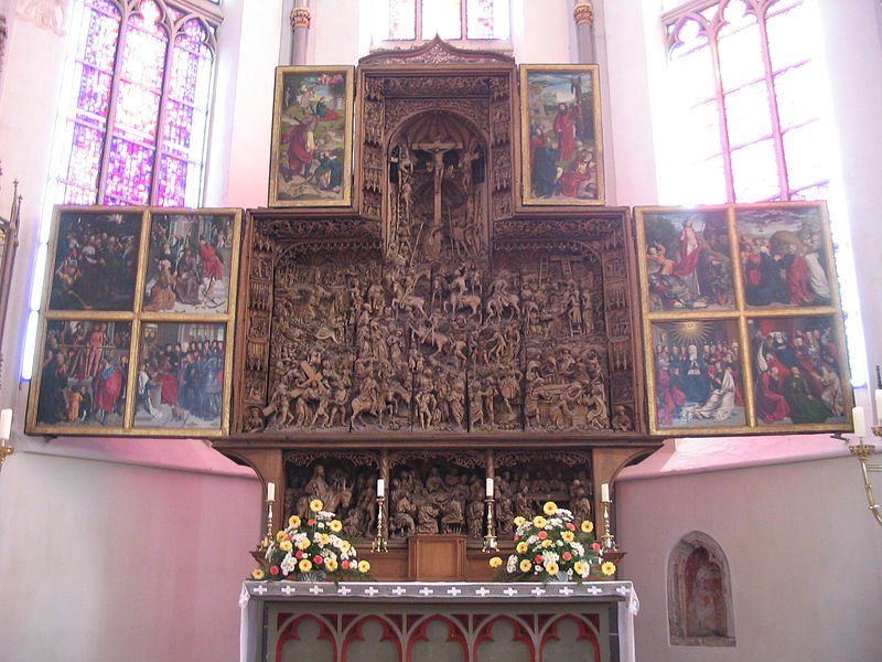
It was during his time with Joest that he worked with his master on the twenty-panelled high altarpiece in the Kalkar church of St Nicholai which is considered to be Joest’s greatest work. From Kalkar, it is believed Joos van Cleve lived around the Ghent-Bruges area and the next we hear of him is in 1511 where he is mentioned in records as a free-master in the Antwerp’ Guild of St Luke, the city’s painters guild, and on a number of occasions he would hold the position of co-deacon of the guild as well as being appointed Dean of the St Luke’s Guild in 1519, 1520 and 1525.

Death of the Virgin
by Joos van Cleve (c.1515)
He set up his own studio in Antwerp and over the next twenty years he took on a number of apprentices. His studio became the most famous in the city and he was inundated with painting commissions, many of which found their way to the leading European royal, ecclesiastic and merchant houses. One of these lucrative commissions came in 1515, from the Nicasius and Georg Hackeney, wealthy merchants of Cologne, for a religious triptych which became known as the Death of the Virgin and which is currently housed in Cologne’s Wallraf-Richartz-Museum. It was from this work that Joos also became known as Master of the Death of the Virgin. It was works like this which brought the Flemish tradition to Cologne, and in so doing brought to bear an extensive influence on the Cologne school of art.
The centre panel of the wide-format triptych is a scene depicting a number of apostles gathered around the bed of the dying Virgin Mary. Of these people, only John and Peter are identifiable. Peter stands before the bed. On the floor is a stool on which lies a Gothic rosary. On the two wings of the triptych there is a depiction of an open river landscape with continuous horizons as well as portraits of the commissioners of the work, Nicasius and Georg Hackeney with their patron saints.
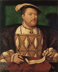
Besides his religious works, Joos van Cleve was an accomplished portrait painter. He was so talented that the king of France at the time, Francis I, summoned him to Paris to work at the French court, during which time he painted a number of portraits of the king, his wife, Eleanor of Austria and members of the court. It is thought that Joos van Cleve also travelled to England around 1534. This belief is based on a fact that he painted a portrait of the forty-four year old monarch, Henry VIII, dated 1535, which is now part of the Royal collection.
Little is known about his family life except that in 1519 Joos van Cleve met and married his first wife, Anna Vijts. The couple had two children, both born in Antwerp. The birth records of the children show them listed as “vander Beke, alias van Cleve” and that their father was registered as an Antwerp burgher which possibly indicates that Joos had registered as an Antwerp citizen in order to be able to work in the city. Joos and Anna had a son, Cornelis, who was born in 1520 and two years later in 1522, Anna gave birth to their daughter, Jozijne. Their son, Cornelis became a talented portrait painter in his own right. He helped his father in his workshop and would, after his father’s death, run the business Cornelis was later known as Sotte Cleve (Mad Cleve) after becoming insane at the age of thirty-four. Joos van Cleve also allegedly had an illegitimate daughter, Tanneken, from his relationship with Clara van Arp. In 1531, three years after the death of his first wife, Anna, Joos married Katlijne van Mispelteren. The couple had no children. The exact date of Joos van Cleve’s death is uncertain but it is known that on November 10th 1540 he wrote his last will and testament and it is believed he died shortly afterwards. In April 1541 his wife, Katlijne, was listed as a widow.
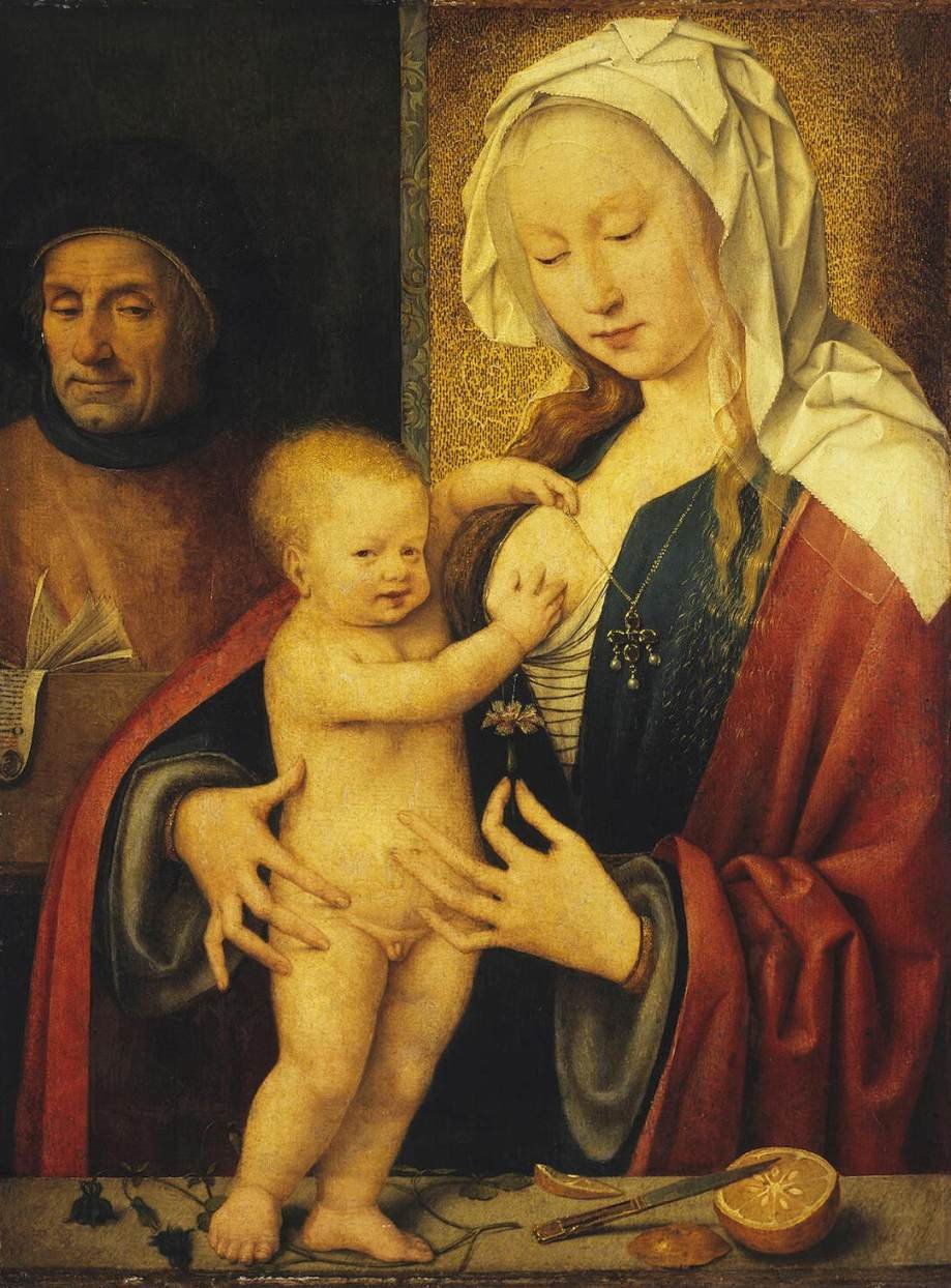
(St Petersburg version)
by Joos van Cleve
The works of art produced by Joos van Cleve merge the emotions of the Italian Renaissance with the exactitude and lucidity of early Netherlandish art. He was also an astute business man who knew the paintings people liked. An example of this is in the way he painted many versions of his most popular subject, The Holy Family. One of these versions is in the Hermitage Museum in Saint Petersburg. In this work we see a half length composition of the Virgin with the upright Christ Child standing on a stone parapet. To the left, and somewhat in the background, is Saint Joseph. The Virgin protects the Child from falling by embracing him with her Mannerist elongated hands. The pose we see before us is often referred to in Latin, as Maria Lactans, “the virgin’s nursing breast”, or “the lactating virgin”, which was the primary symbol of God’s love for humanity.

(Academy of Fine Arts, Vienna)
by Joos van Cleve (c.1515)
In the Academy of Fine Arts in Vienna there is another version of The Holy Family, completed around 1515 and in this rendering we see that Joos van Cleve has added a landscape panorama behind the bespectacled foster-father, Joseph, who seems to be positioned outside the room as he reads his book which rests on the window sill. Again we have the Child standing upright on the parapet held by his mother. Once more, we notice the depiction of the hands circling the child in an Antwerp Mannerism style. To emphasize the close mother-child relationship Joos van Cleve has once again gone for the Maria lactans motif but showing it in a somewhat playful fashion.

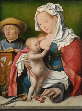
(Metropolitan Museum of Art, New York)
by Joos van Cleve (c.1513)
The Metropolitan Museum of Art, in its Friedsam Collection, has a yet another of Jan van Cleve’s versions of The Holy Family which was painted around 1513. In this version the Christ Child is sitting on the parapet and his lips are tight on the breast of the Virgin as he suckles. On the parapet we see a glass of wine and a plate of fruit which are symbolic of Christ’s incarnation and the sacrifice of his life which will come in the future. Again in the background to the left of the mother and child we have Saint Joseph. In this version he seems less detached and is not concentrating on reading from a book, although he is holding an unfurled scroll.

(Currier Museum in Manchester, New Hampshire )
by Joos van Cleve (c.1520)
The Currier Museum in Manchester, New Hampshire has another version of Joos van Cleve’s The Holy Family, completed around 1520. It is a small painting measuring 74cms x 56cms. In front of the mother and child there is, not the stone parapet which we had seen in the other versions, but a table covered by a green felt cloth. It is a beautiful work which is full of finely detailed still-life objects on the table. Joos van Cleve has adroitly depicted a variety of objects of differing textures varying from a glass vessel to the ermine lining of Mary’s robe. In this painting the Christ Child lies across his mother’s lap clutching an amber-coloured string of beads. As the beads are fixed on the string in five groups of ten we can be almost certain that they represent a rosary. On the table is a glass jar which symbolises the purity of the Virgin. This symbolism comes from the fact that light passes through the vessel without breaking it similar to the impregnation of the seed which entered Mary womb without her hymen being breached. There is a cross reflected in the jar and this is a reminder of how the Christ Child will die and the wine in the jar symbolises the blood of Christ which will be shed during his suffering. Also on the table there is a folded piece of embroidery, known as a sampler. In the left of the painting we have Joseph. He is reading a scroll version of the Magnificat which comes from Luke’s Gospel (1:46-55) and which relates to Mary’s holy stature of Luke:
“…For behold, henceforth all generations will call me blessed, for He who is mighty has done great things for me and holy is His name…”
(National Gallery, London)
by Joos van Cleve (c.1515-20)
The final version of Joos van Cleve’s The Holy Family I want to show you is the one in London’s National Gallery. This version was completed between 1515 and 1520. In this work the figures are depicted close together giving a sense of intimacy, albeit Joseph is set back and does not engage with Mary or the Child. This depiction and positioning of Joseph symbolizes his subordinate, albeit contributory, role in the family relationship. The depiction of Mary is somewhat an idealized and heavenly one but there are definite earthly characteristics about the bespectacled, grey-haired Joseph with his double chin. Again the Maria Lactans depiction of the Virgin reinforces the human characteristic of the child and adds to the intimate and cherished relationship between mother and baby. The Christ Child stands on a smooth stone parapet which is shown in the foreground of the painting. Wrapped around him, almost like a restraint, is the string of beads of an orange rosary. On this ledge Joos van Cleve has depicted a number of inanimate objects which are symbolic. We see the Virgin holding a stalk with three red cherries which symbolise paradise. The glass vase to the left contains a stem of white lilies which symbolizes the purity of the Virgin. It is believed the piece of lemon which has been cut open by the knife which rests upon it may represent the weaning of the child.
In all the Holy Family paintings Joos van Cleve has depicted the Virgin and the Christ Child in a similar fashion whereas his depiction of Saint Joseph standing in the background varies from painting to painting. I wonder why that was. Did he reconsider the role of Saint Joseph differently and thus altered his image?


")

")


")

 (National gallery London")
 Wallace Collection, London")

")

