The two sons of Balthus, Stanislaus and Thadée, edited a book in which they put together letters that their father had written. The book was entitled Correspondance amoureuse avec Antoinette de Watteville 1928-1937 which was published in 2001. One of the letters, dated August 31st 1933 was a letter from Balthus to his father in which he told of his worries about people analysing his work too much and how he tried to ensure that his depictions did not open up the possibility of various interpretations. He wrote:
“…The horrible danger for me, though, is to fall into the trap of becoming anecdotal, but it won’t happen…”

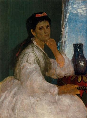
However, a painting he completed in 1946, entitled The Golden Days, received many interpretations which probably annoyed the artist. The work of art can be seen in the Hirshhorn Museum, part of the Smithsonian Institution, Washington, DC. So, should one just look at the painting and not try to guess what was in the mind of Balthus when he painted this picture? Before us is a good looking teenage girl slumped contentedly on a small chaise longue. In her left hand she holds a white hand mirror. The mirror is bathed in light from the window behind her. She studies her own reflection. As we have seen in many of Balthus’ paintings her legs are spread wide apart and her short skirt has ridden up exposing her thighs. Her bodice lies open and has slipped off her right shoulder. Around her neck we see a pearl necklace. On her feet is a pair of white slippers. Behind her there is a wooden table upon which is a white bowl. In the background there is a roaring fire being tended to by a man who is stripped to the waist. So, do we take the painting at face value as Balthus says we should do, or do we start to interpret what we see before us? That’s your choice but I would like to quote a passage in an art essay written by Andre Pijet about the works of Balthus and, in particular, his interpretation of The Golden Days. He was adamant that Balthus’ paintings need to be decoded and by doing so it would reveal the meaning of each element. Pijet wrote:
“…The artwork shows a young girl stretched comfortably on a small sofa and she is preoccupied by looking at the reflection of herself in the white mirror, which she keeps in her left hand. The mirror symbolizes the world, life, femininity, love, and vanity. The pearl necklace on her neck refers to the virginity, health, perfection, and preciousness. The right hand hung down looks as it is suspended in the air. Her torso is partly uncovered suggesting a delicate touch of feminine coquetry. The girl’s legs are spread in provocative invitation of sexual curiosity. Together, the white slippers on her feet, the white mirror and the white pillow behind her head as well as the white bowl on the table completed with the white light projected from the window situated in the back symbolize the innocent purity of the young female beauty. The entire room is divided by the two sources of light. The white light coming from the window on the left is mixed with the red reflections projected by the chimney. Both these lights blend together exactly in the area of the girl’s spread legs suggesting the boundaries between the innocence and the sexual initiation. The sofa itself has a shape of the hiking shoe suggesting that the young beauty is on her way approaching the sexual fire of her first erotic experience. The man on the right is preparing the ground for her erotic enlightenment by warming up the room. On the left side of the chimney, a small statue with phallic forms is standing. Just beside the sculpture the log tongs are leaning against the chimney surface. The log tongs have the shape of female crotch as well as the form of infant what symbolize the process of future maternity. The chimney itself suggests the female sexual organs and the small in posture man working hard to keep the fire on representing symbolically the process of sexual intercourse. The man with his right hand covered with the white glow is touching the chimney that suggests clearly the act of defloration. The massive quantities of symbolic information, which is easily readable after close examination of all elements of the painting, refer to the passage of time from the childhood to the adolescence and the first encounter with sexuality…”
It is interesting to note that Sabine Rewald, the foremost exponent on Balthus and his art, in her book Balthus: Cats and Girls, which was published in conjunction with the 2013 Balthus exhibition at the Metropolitan Museum of Art in New York, never tried to interpret this work of art.
The sitter for this painting was fourteen year old Odile Bugnon and in an interview with Sabine Rewald in 1986, the now married Odile Emery, said that her family of farmers leased the farmstead, part of the Le Guinzet estate outside of Fribourg, from the baron de Cholet and Balthus had been commissioned to paint a portrait of the baron and his two daughters. On one of his last visits Balthus saw Odile playing with some of the baron’s children. He asked if she would like to pose for him. She agreed and Balthus then attained permission from her mother. When she arrived for her sitting Balthus was horrified to see that her mother had taken her to the hairdressers and dressed her up in a pretty dress and black slippers and stockings. Balthus was appalled by the transformation and got Odile to change into the clothes we now see in and carefully posed her in the depiction we now see before us.
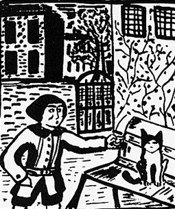
Although we see Odile’s right hand flopped downwards and her fingers pointing towards the floor, in his original version, those fingers were stroking a cat, which was later over-painted shown above. Odile remembers the setting and the pose she was told to take by Balthus. She remembered the roaring fire but said there was no man tending it. As Balthus never completed the work until after he had moved to Villa Diodati in Coligny a small town outside of Geneva in October 1945, Odile never saw the finished work.
Whilst living in Fribourg, Antoinette gave birth to their first son, Stanislas, in October 1942 and in February 1944 their second son Thadée was born. In March 1946 having spent the previous six months in Coligny Balthus and his family ended their Swiss exile and returned to Paris.
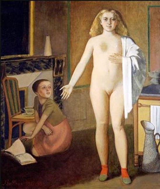
On returning to his Paris studio at 3 cours de Rohan, he worked on his large painting 190 x 160cms (75 x 63in.), which was entitled The Room. He started the work in 1947 and completed it a year later. It is a painting of contrasts. What is the setting? If we look to the left, we see a fire and an ornate mirror, so maybe it is the salon but if we look to the right we see a cooking stove, a towel rack and a speckled water pitcher, so is it the kitchen? Maybe it is a forerunner of a “kitchen diner” ! The two characters depicted in the work are completely dissimilar. Kneeling on the floor and resting her elbow on a chair is a plainly dressed girl who had been reading a book, which lies open on the floor. She is looking up at the other woman, a colossal nude. This woman has long reddish blonde hair and a very thickset body. She has a white towel draped over left shoulder and arm like a cape. The open palm of her right hand points towards her kneeling companion in a gesture of an introduction. What is the relationship between the two figures? Are they mistress and servant?

Some art historians have said that the stance and size of the nude woman reminds them of the 1462 religious work by Piero della Misericordia, entitled Polyptych of the Misericordia. The centre panel of this polyptych showed a very large depiction of the Madonna surrounded by a number of much smaller, in size, followers. Balthus who spent time in Italy in 1926 copying paintings may have come across this religious work, which is housed in the Pinacoteca Communale in Sansepolcro, a town some 70 kilometres east of Siena.
In 1947 Antoinette left Paris with her two sons who were aged three and five. Balthus had decided that his marriage to Antoinette was at an end and their best course of action was to amicably separate. However, it was almost twenty years later before the couple divorced.

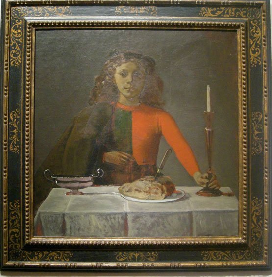
In 1950 Balthus completed another painting depicting the game of cards. This time he has shown two players, a girl and a young man. The painting is simply entitled The Card Players and is housed in the Museo Thyssen-Bornemisza in Madrid. The setting is an unadorned dark room. The painting depicts two youngsters, a boy and a girl, playing cards at a table on which a candlestick stands. The room is lit up by light which emanates from the right-hand side of the room and which illuminates various objects and, in some way, seems to add to the mystery of the picture. We get the impression from the smile on the girl’s face that she is winning and the boy is losing despite his attempt to cheat, as seen by the card hidden behind his back. The depiction of the boy by Balthus is unusual as we see him both in a frontal and profile view.
In January 1949 Balthus’ father Erich died. Balthus spent a lot of time in the early 1950’s designing theatrical sets and costumes for plays, operas and ballets. In 1961 having achieved so much in theatre work he was appointed director of the Académie de France in Rome by his close friend André Malraux, the French Minister of Cultural Affairs. Balthus was to remain in that post and live in Rome until 1977.

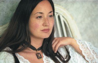
In 1962 Malraux asked Balthus to go to Japan as France’s official “ambassador of art” in order to organize a major exhibition of Japanese art to be held in Paris. During that visit he met Setsuko Ideta, a nineteen year old, first-year student at the Tokyo Sophia Jesuit research University. She was the same age as his first son Stanislaus! Setsuko served as the English translator to the Balthus’ group who were touring the temples in Kyoto.
Setsuko remembered her first meeting with Balthus:
“…We met we spoke, they quarrelled…”
Balthus told her he was 50. But as Setsaku said, it was not true, he was 54. It has to be remembered Balthus was a Leap Year child, born on February 29th. The German poet Rainer Maria Rilke, who had an affair with Balthus’ mother, told Balthus that having a leap-year birthday meant he’d slipped through a crack in time, into a “kingdom independent of all the changes we undergo”, and so Balthus liked to divide his real age by four, so allowing himself to admit to being 50 was somewhat of a compromise! In his book Balthus: A Biography, the author, Nicholas Fox Weber described Setsuko:
“…Setsuko was the embodiment of much that he cherished: female beauty, youthful vitality,piercing intelligence and the charms and diffidence of the Orient…”
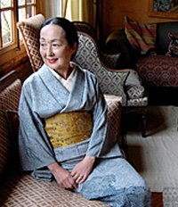
Setsuko was steeped in her Japanese heritage and came from the Samurai family of Kyushu. She was poised and confident. Balthus and Setsuko were married on October 3rd 1967. Balthus and his first wife, Antoinette, were divorced in 1966 after twenty years of separation.
In September 1969, Balthus’ mother Baldine died in Paris, aged 83. In April 1973 Setsuko gave birth to a daughter, Harumi. In 1977, Balthus leaves the position of director of the Académie de France and after living sixteen years at the Villa Medici in Rome, he moves back to Switzerland. Balthus had served two terms as director and was reluctant to leave the Italian capital but at that time there were many high profile kidnappings and he and his wife believed they may one day become targets and so it was the time to leave Balthus’ beloved Rome.

Balthus, Setsuko and their four year old daughter Harumi went to live in Le Grand Chalet at Rossinière. It was a magnificent building. It was the largest known all-wooden structure of its kind in Europe, it was built between 1752 and 1756 by Jean-David Henchoz.
It was to remain Balthus’ home until he died there in August 2001, aged 93. Balthus had been taken ill but left the hospital the night before he died to see once more his large chalet at Rossinière. The funeral was held in the Swiss village of Rossinière, and was attended by a number of high-profile guests, including Prince Sadruddin Aga Khan, the supermodel Elle McPherson and Bono. The French and Italian governments also sent representatives. After the ceremony in the village church, two horses pulled a carriage with the coffin draped in black. The artist was buried at the foot of a hill on a plot owned by the Balthus Foundation, some 300 metres from the chalet. The Irish singer Bono, who was Harumi’s godfather sang at Balthus’ funeral.
Love him and his artwork or hate him for his use of young girls as models, I have found his life story fascinating and can understand why he was one of France’s most famous twentieth century artists.