In my final part of the Arnold Böcklin story I want to look at his portraiture and some of his more evocative Symbolist works. He completed many self portraits, two of which I have shown you at the start of the last couple of blogs. His portraits also included ones of his second wife, Angela Rosa Lorenza Pasucci and their daughter Clara.

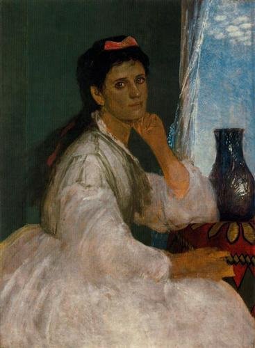
In the first blog about Arnold Böcklin I mentioned his two wives. He married Louise Schmidt in 1850 but she died a year later and then in June 1853, Böcklin married his second wife, a seventeen year old Italian girl, the daughter of a papal guard, Angela Rosa Lorenza Pasucci and she featured in a number of his works of art. One such portrait was entitled Portrait of Angela Böcklin as a Muse which he completed in 1863.

Böcklin completed another portrait of his wife that year entitled Mrs Böcklin with Black Veil. This was a more sombre depiction of his wife. It was painted when she was twenty-seven years of age. It is only a small oil on canvas work within the stretcher frame just measuring 19 x 14 cms. This was a painting he completed for himself. There is a certain intimacy about the work. The artists depicts his wife with a black veil on her head and this veil serves the purpose of being a frame for his wife’s face, the colour of which is in contrast to the simple olive green background. Angela Böcklin seems to be very thoughtful, even slightly sad. Maybe she is in mourning for we know she and Arnold had fourteen children but only eight of them survived him. We take it for granted that we will die before our children but in the nineteenth century that was not always the case, in fact the opposite was often true, and although it was a common occurrence for children to die young we should never underestimate its tragic consequences.
In 1872 he completed one of a number of portraits of his daughter Clara.
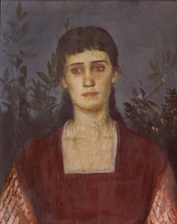
In 1876, when she was twenty-one years of age, Böcklin painted another portrait of her. It was also in this year that Clara married the sculptor, Peter Bruckmann.
Böcklin became somewhat fixated by death and this is borne out with his evocative painting Die Toteninsel, which I talked about in the previous blog. This preoccupation, which could have been because of the loss of his children, was clearly seen in yet another of his self portraits, which he completed in 1872, shortly after the death of his young daughter, and was entitled Self Portrait with Death as a Fiddler. It was completed whilst Böcklin was in Munich having just travelled back from Italy. It was in Italy that Böcklin began to add symbols into his paintings in order to suggest ideas. The interesting thing about Symbolism in art is that we can each come to our own conclusions about what we see in a painting and unless the artist has spoken about the painting then we have as much right to postulate about an artist’s reasoning behind their work as the next person. So having looked at the work, what do you make of it? Let me make a few suggestions about what I think may have been in Böcklin’s mind when he put brush to canvas.

We can see that Arnold has portrayed himself with painting brush in one hand whilst the thumb of his other hand is hooked through the hole in the palette securing a piece of cloth. However what is more interesting is the inclusion of the skeleton playing the fiddle in the background. The question I pose is – what was Böcklin thinking about when he decided to include the skeleton? We know that most paintings, which include a skull or skeleton, are Vanitas paintings. A vanitas painting contains an object or a collection of objects which symbolise the inevitability of death and the transience of life. Such paintings urge the viewer to consider mortality and to repent ! So, Böcklin’s inclusion of a skeleton is a reminder to him that he cannot take life for granted and that there is a very fine line between life and death.
Look at the juxtaposition of the artist and the skeleton. Look how the skeleton appears to be whispering something in Böcklin’s ear and the artist in the painting turns his head slightly and leans back to listen. He is staring out of the painting, but not at us. He is staring out but his full attention is on what the skeleton is saying. Maybe the skeleton is telling the artist something about his future? Look also at the fiddle that the skeleton is playing. It has only one string left. Why paint the fiddle with just one string? Is this something to do with the length of time Böcklin has on this earth? Is it that at birth the violin had all four strings but, as time progressed, string after string broke and so, at the time of death, there are no strings?
The painting can now be seen at the Alte Nationalgalerie in Berlin.

Other subjects that appeared in Böcklin’s paintings during his last period of creativity were the Naiads and Nereids or sea and water nymphs often referred to as female spirits of sea waters. The next painting I am showcasing is entitled Naiads at Play which Böcklin completed around 1862 and now hangs in the Kunstmuseum Basel. Böcklin’s biographer, Henri Mendelssohn described the painting, writing:
“…It fairly bubbles over with fun and merriment. The scene represents a rock in the ocean, over which the waves dash in foam, tossing white spray high into the air. Clinging fast to the wet rock face are the gleaming forms of naiads, their tails shining like jewels in the seething waters, as the waves dash, one on top of another, so do the creatures of the sea chase each other in their frolic, darting here and diving there, and tumbling heels over head from the rock into the ocean beneath, whose roar almost drowns their shrill laughter. All is life and movement. The sputtering triton and the luckless baby, holding in his convulsive clasp the prize he has captured, a little fish, rank among the inimitable creations of Böcklin’s art…”
Marie Joseph Robert Anatole, Comte de Montesquiou-Fézensac, a French Symbolist poet and art collector of the time, described Böcklin’s work, writing:
“…”This is the most astonishing of all Böcklin’s representations of the sea. The water gleams with hues as violent as those reflected by the Faraglioni, the red rocks which, seen from Capri, mirror their purple shadows in the blue waves. One of the naiads, with her back turned to us, seems to set the water on fire with the brilliancy of her orange-coloured hair, while all the naiads’ tails, wet and glistening, glow with the gorgeous hues of butterflies’ wings or the petals of brilliant flowers…”
Looking at the work one can understand the comments. It is as if you were there, feeling the energy and almost feeling the spray on your face. From this mythical subject, Böcklin has almost turned it into reality, such was his skill.

Another painting by the Swiss symbolist Böcklin which illustrates his fascination with nightmares, the plague and death was one he completed in 1898 entitled Plague. It is a tempera on wood painting, which is now hanging in the Kunstmuseum Basel. In the painting the setting is the street of a medieval town and we see the grim-faced Death, scythe in hand, riding a winged creature, which spews out miasma. The colours Böcklin used in this painting are black and dull browns for the clothes of many of the inhabitants who desperately throw themselves out of the path of Death and shades of pale green which is often associated with death and putrefaction. The one detail which is devoid of drab colours is that of the clothes worn by the woman in the foreground who lies across the body of the woman who has suffered at the hands of Death. Her gold-embroidered red cloak signifies that she comes from a wealthy household and the painting reinforces the fact that Death takes both rich and poor. The plague had ravished Europe throughout the 14th to 17th centuries. It knew no boundaries of class or wealth.

Around 1874 Böcklin completed a painting entitled Roger and Angelica. It can now be seen in the Nationalgalerie in Berlin. The scene, Roger rescuing of Angelica, is based on the 1532 epic romantic poem, Orlando Furioso by Ludivico Ariosto, which is all about the conflict between the Christians and the Saracens. The painting depicts the main character, Ruggerio (Roger), a Saracen warrior, coming to the rescue of Angelica, the daughter of a king of Cathay. She is chained to a rock on the shoreline and is about to be killed by the sea monster, the giant turquoise orc, which has wrapped itself around the helpless Angelica. In the background we see Roger arriving astride his horse. The battle with the orc is ended when Roger dazzles the sea monster with his shield allowing him the chance to place a magic ring on the finger of Angelica which protects her whilst he undoes the bonds which were tying her to the tree.
 Arnold Böcklin moved around Europe, living in Munich, Florence and the small Swiss town of Hottingen which was close to Zurich but from 1892 onwards he settled down near Florence in the town of San Domenico. To mark his seventieth birthday a retrospective of his work was held in Basel, Berlin and Hamburg. Böcklin died of tuberculosis, aged 73, in Fiesole, a small town northeast of Florence, in January 1902 and is buried in the Cimitero Evangelico degli Allori in southern Florence.
In my next blog I will be looking at the work of an artist who was known as the king of the cats as many of his paintings had an obligatory cat in the depiction. However he was probably more remembered by his erotic paintings which featured pre pubescent girls in all manner of provocative poses. In this day and age many of his works would struggle to be exhibited because of the age of his models.